Plotly vs Matplotlib: Which is Better for Data Visualization
- Name
- Oluwaseun Adeojo
Published on
Data visualization is a crucial component of any data analysis project. It has the power to convert complex data into easy-to-understand visuals, enabling us to quickly comprehend intricate patterns and trends. In the Python ecosystem, two libraries have emerged as the frontrunners in data visualization: Plotly and Matplotlib. This article aims to provide a comprehensive comparison of these two libraries, exploring their features, strengths, and limitations. We will also delve into the question of which library is better suited for different data visualization tasks.
Plotly and Matplotlib, while both powerful in their own right, offer different capabilities and features that make them suitable for different kinds of tasks. Understanding these differences is crucial for choosing the right tool for your data visualization needs. In the following sections, we will explore these libraries in depth, providing examples and comparisons to help you make an informed decision.
What is Plotly?
Plotly is a modern, open-source data visualization library that provides interactive and high-quality graphs. It allows users to create a wide variety of visualizations, including basic charts like line, bar, and pie charts, as well as more complex ones like 3D charts, geographic maps, and heatmaps. One of the key features of Plotly is its interactivity. Users can zoom, pan, hover over data points, and even click on elements to trigger events.
Plotly is also highly customizable, allowing users to modify almost every aspect of their charts, from colors and layout to fonts and axes. Moreover, Plotly supports a wide range of formats for exporting your visualizations, including PNG, JPEG, SVG, and PDF. This makes it a versatile tool for creating visualizations for both web applications and print media.
Here is a simple example of how to create a line chart using Plotly:
import plotly.express as px

df = px.data.gapminder().query("country=='Canada'")
fig = px.line(df, x="year", y="lifeExp", title='Life expectancy in Canada')
fig.show()
In this example, we're using the gapminder dataset available in Plotly Express and creating a line chart that shows the life expectancy in Canada over the years.
How is Plotly different from Matplotlib?
While Plotly focuses on providing interactive and customizable visualizations, Matplotlib takes a different approach. Matplotlib is one of the oldest and most widely used data visualization libraries in Python. It provides a large number of options for creating static, animated, and interactive plots in both 2D and 3D.
Matplotlib is known for its flexibility and control over every element in a figure, including figure size, dpi, text location, color, style, etc. It's also known for its ability to produce publication-quality figures in a variety of hardcopy formats and interactive environments across platforms. However, this flexibility comes with a cost: Matplotlib's API can be complex and intimidating for beginners.
In contrast, Plotly's API is more user-friendly and intuitive, making it a better choice for those who are new to data visualization or those who prefer a more straightforward approach to creating visualizations. However, this simplicity can sometimes limit the level of customization that can be achieved compared to Matplotlib.
Here is an example of creating a similar line chart using Matplotlib:
```python
import matplotlib.pyplot as plt
import pandas as pd

## Assuming df is a pandas DataFrame with the same data as the previous example
df = pd.DataFrame({
    'year': [1952, 1957, 1962, 1967, 1972, 1977, 1982, 1987, 1992, 1997, 2002, 2007],
    'lifeExp': [68.75, 69.96, 71.30, 72.13, 72.88, 74.21, 75.76, 76.86, 77.95, 78.61, 79.77, 80.65]
})

plt.figure(figsize=(10, 5))
plt.plot(df['year'], df['lifeExp'])
plt.title('Life expectancy in Canada')
plt.xlabel('Year')
plt.ylabel('Life Expectancy')
plt.grid(True)
plt.show()
In this example, we're creating a line chart that shows the life expectancy in Canada over the years, similar to the previous Plotly example. However, as you can see, the code is a bit more verbose and requires more manual configuration.
Which library is better for data visualization: Plotly or Matplotlib?
Determining which library is "better" for data visualization largely depends on the specific needs and preferences of the user. Both Plotly and Matplotlib have their strengths and can be used effectively for different types of tasks.
Plotly shines when it comes to creating interactive and web-based visualizations. Its user-friendly API and high level of customization make it a great choice for creating visually appealing and interactive charts for web applications. Additionally, Plotly's ability to handle large datasets efficiently and its support for a wide range of export formats make it a versatile tool for both data exploration and presentation.
On the other hand, Matplotlib excels in creating static and complex plots with high precision. Its comprehensive API and fine-grained control over every aspect of a figure make it the go-to library for creating publication-quality visualizations. Moreover, Matplotlib's wide range of supported plot types and its integration with other Python libraries like NumPy and Pandas make it a powerful tool for scientific computing and technical applications.
Another Alternative to Matplotlib and Ploty: PyGWalker
PyGWalker (pronounced as "Pig Walker") is a quirky portmanteau of "Python binding of Graphic Walker". It fuses Jupyter Notebook (or other jupyter-based notebooks) with Graphic Walker (opens in a new tab). Data scientists can now build up data visualizations using straightforward dragging and dropping, instead of using Python codes!
You can try PyGWalker right now at Google Colab (opens in a new tab), Kaggle Code (opens in a new tab), ![]() (opens in a new tab), or the Graphic Walker Online Demo (opens in a new tab)!
(opens in a new tab), or the Graphic Walker Online Demo (opens in a new tab)!
Here is how you can quickly get started with PyGWalker:
Setup pygwalker
Before diving in, please make sure to install the necessary packages through the command line using either pip or conda. Using Pip: To install PygWalker, simply run
pip install pygwalkerIf you want to keep your version up-to-date with the latest release, try:
pip install pygwalker --upgradeAlternatively, you can also use
pip install pygwalker --upgrade --preto obtain the latest features and bug-fixes.
Using Conda-forge:
To install PygWalker through conda-forge, run either
conda install -c conda-forge pygwalkeror
mamba install -c conda-forge pygwalkerFor more help, check out the conda-forge feedstock.
Run PyGWalker
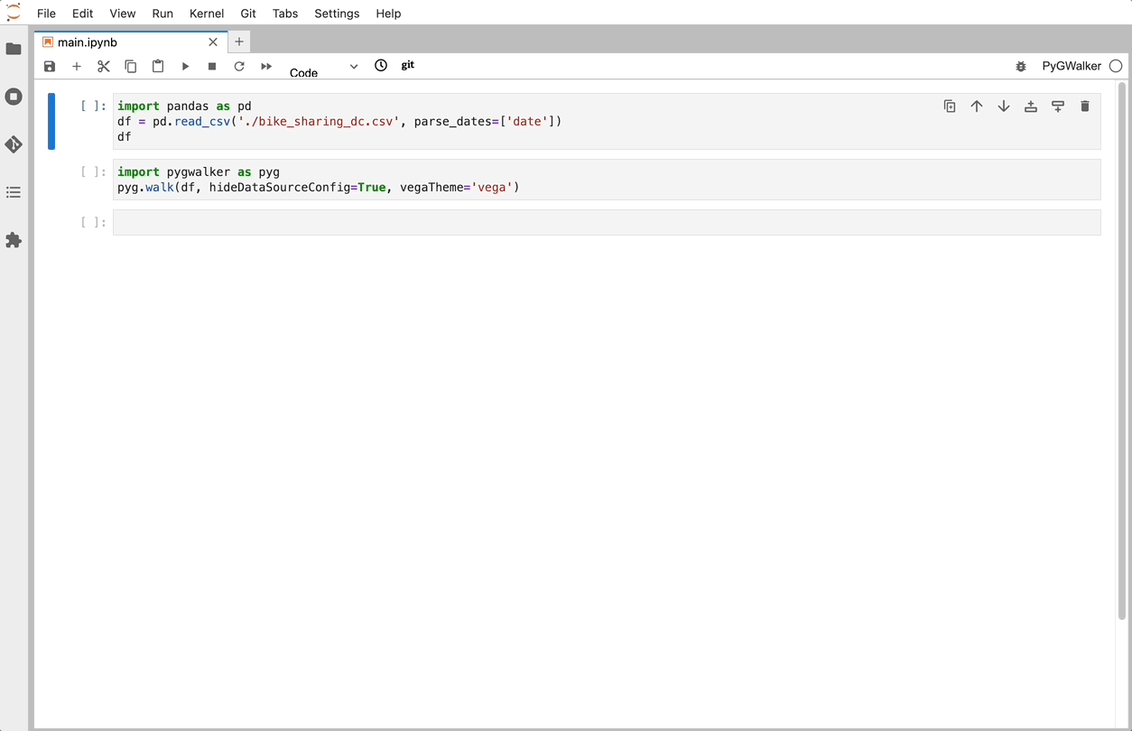
Once you have PygWalker installed, you can start using it in Jupyter Notebook by importing pandas and PygWalker.
import pandas as pd
import pygwalker as pyg
PygWalker integrates smoothly into your existing workflow. For example, to call up Graphic Walker with a dataframe, you can load your data using pandas and then run:
df = pd.read_csv('./bike_sharing_dc.csv', parse_dates=['date'])
gwalker = pyg.walk(df)
If you're using polars (version pygwalker>=0.1.4.7a0), you can also use PygWalker like this:
import polars as pl
df = pl.read_csv('./bike_sharing_dc.csv',try_parse_dates = True)
gwalker = pyg.walk(df)
For even more flexibility, you can try PygWalker online through Binder (opens in a new tab), Google Colab (opens in a new tab), or Kaggle Code (opens in a new tab).
That's it. Now you have a Tableau-like user interface to analyze and visualize data by dragging and dropping variables.
Are there any limitations to using either library?
Like any tool, both Plotly and Matplotlib have their limitations. For Plotly, one of the main limitations is its performance with large datasets. While Plotly can handle large datasets more efficiently than many other visualization libraries, it can still struggle with very large datasets or complex visualizations, leading to slower rendering times.
Another limitation of Plotly is its reliance on JavaScript for rendering. This means that users must have JavaScript enabled in their browsers to view Plotly visualizations. While this is not an issue for most modern web browsers, it can be a problem for users with older browsers or those who have disabled JavaScript for security reasons.
Matplotlib, on the other hand, has a steep learning curve due to its comprehensive and sometimes complex API. While this gives users a high degree of control over their visualizations, it can also make it difficult for beginners to get started with the library. Additionally, Matplotlib's focus on static and complex plots means it lacks some of the interactive features that make Plotly so appealing for web-based applications.
Can Plotly and Matplotlib be used together?
Yes, Plotly and Matplotlib can be used together in the same project. In fact, Plotly can even convert Matplotlib figures into interactive Plotly figures using the plotly.tools.mpl_to_plotly function. This allows users to leverage the strengths of both libraries, using Matplotlib for complex static plots and Plotly for interactive and web-based visualizations.
Here is an example of how to convert a Matplotlib figure into a Plotly figure:
import matplotlib.pyplot as plt
import plotly.tools as tls

## Create a simple Matplotlib figure
plt.figure()
plt.plot([1, 2, 3, 4, 5], [1, 2, 3, 4, 5])

## Convert the figure to a Plotly figure
plotly_fig = tls.mpl_to_plotly(plt.gcf())
plotly_fig.show()
In this example, we first create a simple line chart using Matplotlib. We then convert this figure into a Plotly figure using the mpl_to_plotly function from the plotly.tools module. The resulting figure is an interactive Plotly figure that retains the look and feel of the original Matplotlib figure.
Comparing Plotly and Matplotlib with Other Libraries
While Plotly and Matplotlib are two of the most popular data visualization libraries in Python, they are by no means the only options. There are many other libraries available that offer different features and capabilities. One such library is Seaborn, which is built on top of Matplotlib and provides a high-level interface for creating attractive statistical graphics.
Seaborn integrates well with the PyData stack, including support for numpy and pandas data structures and statistical routines from scipy and statsmodels. It also has built-in themes for styling matplotlib graphics. While Seaborn doesn't offer the same level of interactivity as Plotly, it excels in creating complex statistical visualizations with fewer lines of code.
Conclusion
In conclusion, both Plotly and Matplotlib are powerful tools for data visualization in Python. The choice between them depends on the specific needs of your project and your personal preferences. By understanding the strengths and limitations of each library, you can make an informed decision and choose the tool that best fits your needs. Whether you're creating simple line charts for a web application or complex 3D plots for a scientific paper, there's a Python library out there that's perfect for your needs.
FAQs
-
What are the main differences between Plotly and Matplotlib? Plotly is known for its interactive plots and user-friendly interface, while Matplotlib is known for its flexibility and control over every aspect of a figure. Plotly is generally better for web-based and interactive visualizations, while Matplotlib is better for creating static and complex plots with high precision.
-
Can Plotly and Matplotlib be used together? Yes, Plotly and Matplotlib can be used together in the same project. Plotly can even convert Matplotlib figures into interactive Plotly figures using the
plotly.tools.mpl_to_plotlyfunction. -
What are some limitations of Plotly and Matplotlib? Plotly can struggle with very large datasets or complex visualizations, and it requires JavaScript to render the visualizations. Matplotlib, on the other hand, has a steep learning curve due to its comprehensive and sometimes complex API.