Remove Axes in Matplotlib: A Comprehensive Guide
- Name
- Oluwaseun Adeojo
Published on
Matplotlib is a powerful Python library for data visualization, but to craft truly effective plots, you sometimes need to remove certain elements like axes. If you've been wondering how to remove axes in Matplotlib, this guide is your perfect starting point. Let's delve into how to make your charts shine by removing unnecessary elements, following best practices from Matplotlib's own documentation and community wisdom.
Getting Started: What Are Axes in Matplotlib?
Before we begin, it's important to understand what we mean by 'axes' in Matplotlib. The term 'axes' refers to the x and y-axis on a plot, including the labels, ticks, and the line bordering the plot area. When you remove the axes, you are left with a clean, minimalist plot that focuses on the data presentation without additional distractions.
Why Remove Axes?
There are several reasons you might want to remove the axes from a Matplotlib plot. Perhaps the most common reason is to create a cleaner, simpler visual appearance. By removing axes, gridlines, and labels, you can help viewers focus on the most crucial part of your visualization: the data.
Removing Axes: The Basics
Now, let's jump straight to the heart of the matter: how to remove axes in Matplotlib. The process is fairly simple, requiring just a few lines of code. Consider this basic example:
import matplotlib.pyplot as plt

x = [1, 2, 3, 4, 5]
y = [2, 3, 5, 7, 11]

plt.plot(x, y)
plt.gca().set_axis_off()
plt.show()
In this script, we use the gca() function to get the current axes, then call the set_axis_off() method to turn off the axes. After running this script, you should see a line plot with no visible axes.
Removing Axes and Saving the Figure
What if you want to save your figure without axes? Matplotlib provides a simple method to save your plots into a file. Here is how you can save a plot without axes:
plt.plot(x, y)
plt.gca().set_axis_off()
plt.savefig('my_plot.png', bbox_inches='tight', pad_inches = 0)
plt.close()
The savefig() function is used to save the current figure, and we pass the filename 'my_plot.png' as the argument. The bbox_inches='tight' and pad_inches=0 parameters remove extra padding around the plot in the saved figure. After running this script, a new file named 'my_plot.png' should appear in your current directory, containing your saved plot without axes.
Advanced: Removing Axes from Subplots
So far, we've discussed how to remove axes from a single plot. But what if you have multiple subplots and want to remove axes from all of them, or a specific one? Here's how to do it:
fig, axs = plt.subplots(2, 2)

for ax in axs.flat:
    ax.set_axis_off()

plt.savefig('subplot_no_axes.png', bbox_inches='tight', pad_inches = 0)
plt.close()
In this code, we create a 2x2 grid of subplots using the plt.subplots() function, and then iterate over each subplot (accessed using axs.flat), removing the axes with ax.set_axis_off(). The figure is then saved as before, creating an image file with multiple subplots, each without axes.
Alternatives to Removing Axes: Adjusting Axis Appearance
In some cases, you might want to keep the axes but make them less obtrusive. Matplotlib provides many options for customizing the appearance of axes. Here's an example of how to make the axes less noticeable by reducing the line width and changing the color:
ax = plt.gca()
ax.spines['top'].set_color('none')
ax.spines['bottom'].set_linewidth(0.5)
ax.spines['left'].set_linewidth(0.5)
ax.spines['right'].set_color('none')
In this script, we first get the current axes with plt.gca(). Then we use the spines property to access each of the four sides of the axes ('top', 'bottom', 'left', and 'right'). We then call set_color('none') to remove the top and right sides of the axes, and set_linewidth(0.5) to make the bottom and left sides thinner.
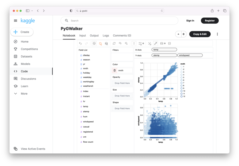
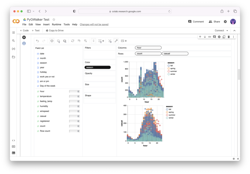
Alternative to Matplotlib: Visualize Data with PyGWalker
Besides using Matplotlib to visualize your pandas dataframe, here is an alternative, Open Source python library that can help you create data visualization with ease: PyGWalker (opens in a new tab).

No need to complete complicated processing with Python coding anymore, simply import your data, and drag and drop variables to create all kinds of data visualizations! Here's a quick demo video on the operation:
Here's how to use PyGWalker in your Jupyter Notebook:
pip install pygwalker
import pygwalker as pyg
gwalker = pyg.walk(df)
Alternatively, you can try it out in Kaggle Notebook/Google Colab:
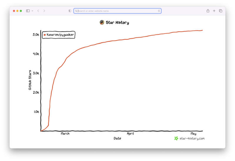
PyGWalker is built on the support of our Open Source community. Don't forget to check out PyGWalker GitHub (opens in a new tab) and give us a star!
Wrapping Up
Removing axes in Matplotlib can help you create cleaner, more impactful visualizations by focusing attention on the data. This guide has shown you how to remove axes from a single plot or multiple subplots, and how to adjust the appearance of axes to make them less obtrusive. With these techniques in your toolbox, you're ready to create stunning, minimalist plots with Matplotlib.
FAQ
Q: Are there cases when it's not advisable to remove axes in Matplotlib?
Yes, removing axes can sometimes make it difficult to interpret a plot, particularly when the scale or proportions of the data are important. You should always consider the needs of your audience and the nature of your data when deciding whether to remove axes.
Q: Can I remove axes from plots created with Seaborn, which is based on Matplotlib?
Yes, you can remove axes from Seaborn plots in the same way as Matplotlib plots. Seaborn uses Matplotlib under the hood, so the same commands will work.
Q: Can I still add a title to my plot after removing axes?
Yes, removing the axes does not affect the ability to add a title to your plot. You can use the plt.title() function to add a title at any time.