How to Quickly Create Multiple Line Plots with Matplotlib
- Name
- Sebastian Brandt
Published on
Data visualization is a key part of any data analysis pipeline. It allows for the clear and intuitive representation of complex datasets, and for uncovering trends and patterns that might not be obvious from the raw data alone. Among the plethora of tools available for this purpose, Matplotlib is one of the most widely used Python libraries, providing a versatile and powerful platform for creating static, animated, and interactive plots.
A commonly used feature in Matplotlib is its ability to create multiple line plots in a single chart. In this comprehensive guide, we'll delve into the specifics of how you can create these visualizations, focusing on both basic principles and more advanced concepts.
The Basics: Plotting Two Lines
Let's start with a simple scenario: plotting two line graphs in the same plot. Here's the code a user posted on an online forum, reporting that the y-axis was being printed twice:
import matplotlib.pyplot as plt

x = [0, 1, 2, 3, 4, 5]
y1 = ['1000', '13k', '26k', '42k', '60k', '81k']
y2 = ['1000', '13k', '27k', '43k', '63k', '85k']

plt.plot(x, y1)
plt.plot(x, y2, '-.')

plt.xlabel("X-axis data")
plt.ylabel("Y-axis data")
plt.title('multiple plots')
plt.show()
A simple glance at the code reveals the root of the issue: the y-values being plotted are strings instead of numbers. When matplotlib encounters string data, it does not plot these values on a numeric scale. Instead, it simply plots the string labels at their respective x-coordinates, leading to multiple labels being superimposed on the y-axis.
Fixing the String Issue: Converting to Numeric
To remedy this issue, the 'k' in the strings needs to be replaced with 'e3', allowing these strings to represent numbers in scientific notation. They can then be converted to floating point numbers using Python's float() function.
The corrected code would then look like this:
import matplotlib.pyplot as plt

x = [0, 1, 2, 3, 4, 5]

y1 = ['1000', '13k', '26k', '42k', '60k', '81k']
y2 = ['1000', '13k', '27k', '43k', '63k', '85k']

plt.plot(x, [float(i.replace('k', 'e3')) for i in y1])
plt.plot(x, [float(i.replace('k', 'e3')) for i in y2], '-.')

plt.xlabel("X-axis data")
plt.ylabel("Y-axis data")
plt.title('multiple plots')
plt.show()
With this simple change, the user was able to correctly plot two lines on the same chart without duplication of labels on the y-axis. It is important to note, however, that this conversion is done purely for plotting purposes and does not modify the original data.
Fine-Tuning Multiple Line Plots: Legends, Gridlines, and Annotations
Legends can be added to the plot using the legend() function, while gridlines can be toggled on or off using the grid() function. For annotations, you can use the annotate() function to add informative text to the chart.
By applying these techniques, our final code for creating multiple line plots in matplotlib could look something like this:
import matplotlib.pyplot as plt

x = [0, 1, 2, 3, 4, 5]

y1 = ['1000', '13k', '26k', '42k', '60k', '81k']
y2 = ['1000', '13k', '27k', '43k', '63k', '85k']

plt.plot(x, [float(i.replace('k', 'e3')) for i in y1], label='Line 1')
plt.plot(x, [float(i.replace('k', 'e3')) for i in y2], '-.', label='Line 2')

plt.xlabel("X-axis data")
plt.ylabel("Y-axis data")
plt.title('multiple plots')
plt.grid(True)
plt.legend()
plt.annotate('Peak value for Line 2', xy=(4, 85000), xytext=(3, 70000),
             arrowprops=dict(facecolor='black', shrink=0.05))

plt.show()
As evident, creating multiple line plots with Matplotlib is a relatively straightforward process that offers a wide range of customization options for creating beautiful, informative, and insightful visualizations.
FAQ
Q: Can I plot more than two lines in a single chart with Matplotlib?
Yes, you can plot as many lines as you need on a single chart using Matplotlib. Simply repeat the plot() function with the desired data for each line.
Q: What other types of plots can I create with Matplotlib?
Matplotlib supports a wide array of other plot types, including scatter plots, bar graphs, histograms, and even 3D plots. The library is highly versatile and can accommodate almost any data visualization need.
Q: How can I save my plot to a file using Matplotlib?
After you have created your plot, you can use the savefig() function to save it to a file. The function takes a filename as an argument, and you can specify the format of the file (e.g., PNG, PDF, SVG, etc.) by using the appropriate file extension.
plt.savefig('my_plot.png')Alternative to Matplotlib: Visualize Data with PyGWalker
Besides using Matplotlib to visualize your pandas dataframe, here is an alternative, Open Source python library that can help you create data visualization with ease: PyGWalker (opens in a new tab).

No need to complete complicated processing with Python coding anymore, simply import your data, and drag and drop variables to create all kinds of data visualizations! Here's a quick demo video on the operation:
Here's how to use PyGWalker in your Jupyter Notebook:
pip install pygwalker
import pygwalker as pyg
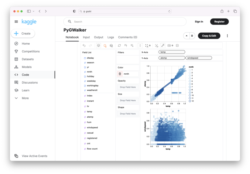
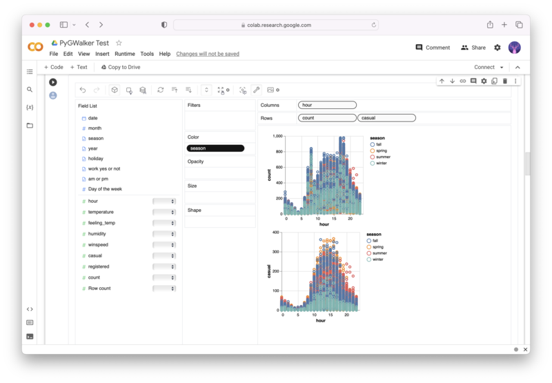
gwalker = pyg.walk(df)Alternatively, you can try it out in Kaggle Notebook/Google Colab:
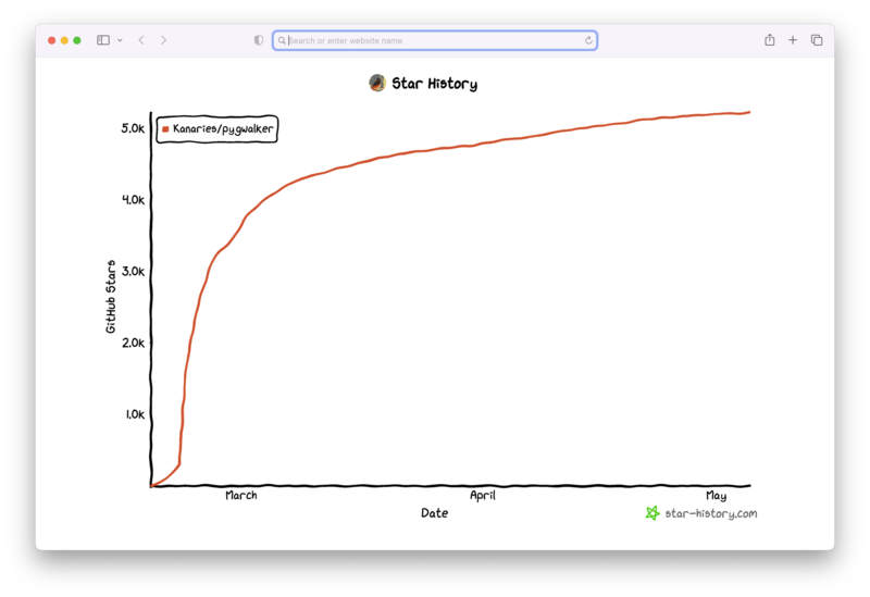
PyGWalker is built on the support of our Open Source community. Don't forget to check out PyGWalker GitHub (opens in a new tab) and give us a star!
FAQ
Can I plot more than two lines in a single chart with Matplotlib?
Yes, you can plot as many lines as you need on a single chart using Matplotlib. Simply repeat the plot() function with the desired data for each line
What other types of plots can I create with Matplotlib?
Matplotlib supports a wide array of other plot types, including scatter plots, bar graphs, histograms, and even 3D plots. The library is highly versatile and can accommodate almost any data visualization need.
How can I save my plot to a file using Matplotlib?
After you have created your plot, you can use the savefig() function to save it to a file. The function takes a filename as an argument, and you can specify the format of the file (e.g., PNG, PDF, SVG, etc.) by using the appropriate file extension.