How to Plot a DataFrame using Pandas
Published on
Data visualization is an essential skill for anyone working with data. It helps you gain insights into your data, present results more effectively, and communicate complex information in a simple, visual manner. In this guide, we'll show you how to plot a DataFrame using Pandas, a powerful data analysis tool in Python.
Want to quickly create Data Visualizations in Python?
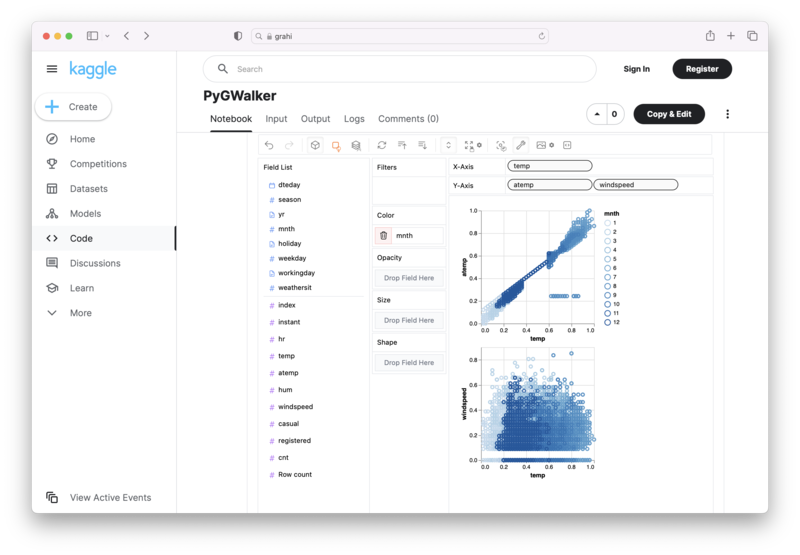
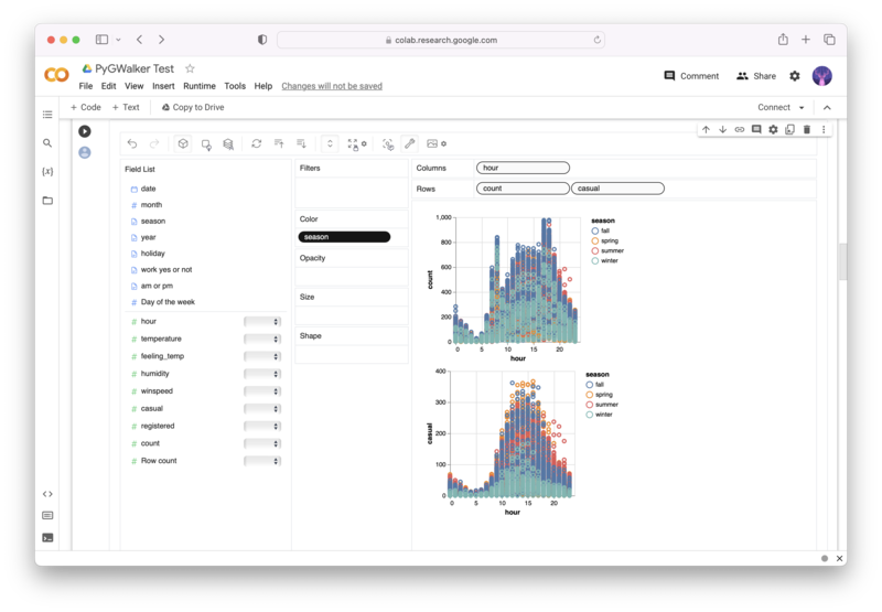
PyGWalker is an Open Source Python Project that can help speed up the data analysis and visualization workflow directly within a Jupyter Notebook-based environments.
PyGWalker (opens in a new tab) turns your Pandas Dataframe (or Polars Dataframe) into a visual UI where you can drag and drop variables to create graphs with ease. Simply use the following code:
pip install pygwalker
import pygwalker as pyg
gwalker = pyg.walk(df)
You can run PyGWalker right now with these online notebooks:
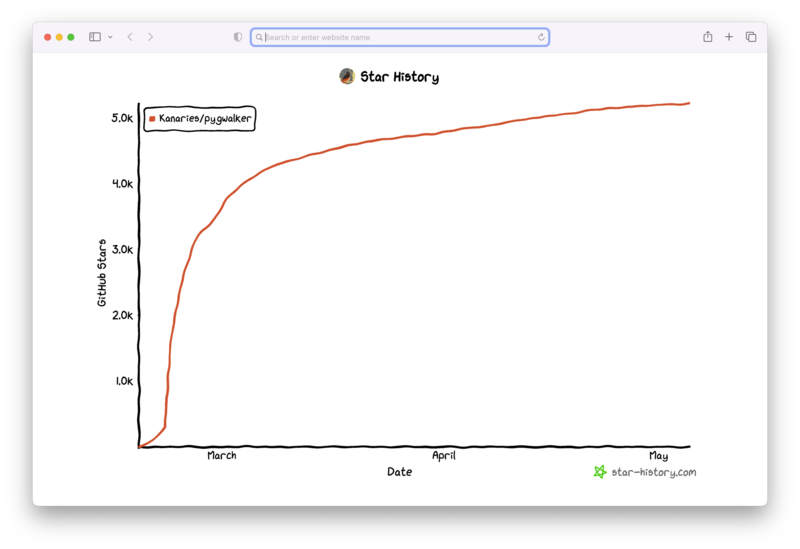
And, don't forget to give us a ⭐️ on GitHub!
What is Pandas?
Pandas is an open-source library that provides high-performance, easy-to-use data structures and data analysis tools for Python. It is built on top of Matplotlib (opens in a new tab), a popular plotting library in Python, and provides a user-friendly interface for creating a variety of plots.
What are the benefits of using Pandas for data visualization?
Pandas offers several advantages for data visualization, including:
- Easy handling of large datasets
- Integration with other Python libraries
- A wide range of plot types
- Customizability for complex visualizations
What are the different kinds of plots that can be created with Pandas?
Pandas supports a wide variety of plot types, including:
- Line plots
- Bar plots
- Histograms
- Box plots
- Scatter plots
- Hexbin plots
- Area plots
- Pie charts
How do you import libraries and datasets in Pandas?
Before you can start plotting, you'll need to import the necessary libraries and load your dataset. Here's an example of how to import Pandas and read a CSV file:
import pandas as pd

data = pd.read_csv('data.csv')
What is a line plot in Pandas?
A line plot is a type of plot that displays information as a series of data points connected by straight line segments. It is useful for visualizing trends and relationships between variables over time.
Here's an example of how to create a simple line plot in Pandas:
data.plot(kind='line', x='date', y='price')How do you create a bar plot in Pandas?
A bar plot is a type of plot that displays data using rectangular bars, where the lengths of the bars represent the values of the data. It is useful for visualizing categorical data and comparing values between categories.
Here's an example of how to create a simple bar plot in Pandas:
data.plot(kind='bar', x='category', y='value')Now that you have a basic understanding of Pandas and its plotting capabilities, let's dive into some more advanced examples.
Example 1: Line Plot of Monthly Stock Prices
In this example, we'll plot the monthly stock prices of three tech giants: Facebook, Microsoft, and Apple. First, we'll import the necessary libraries and load the stock data:
import pandas as pd import matplotlib.pyplot as plt stock_data = pd.read_csv('stock_data.csv')Next, we'll resample the data to get the average stock price for each month:
monthly_data = stock_data.resample('M', on='Date').mean()Finally, we'll plot the monthly stock prices for each company:
monthly_data.plot(kind='line', x='Date', y=['Facebook', 'Microsoft', 'Apple'])
plt.title('Monthly Stock Prices of Facebook, Microsoft, and Apple')
plt.xlabel('Date')
plt.ylabel('Stock Price')
plt.legend(['Facebook', 'Microsoft', 'Apple'])
plt.show()
This plot shows the monthly stock price trends of Facebook, Microsoft, and Apple, allowing us to compare their performance over time.
Example 2: Bar Plot of Product Sales
In this example, we'll create a bar plot to visualize the sales of different products in a store. First, let's import the necessary libraries and load the sales data:
import pandas as pd import matplotlib.pyplot as plt sales_data = pd.read_csv('sales_data.csv')Next, we'll aggregate the sales data by product:
product_sales = sales_data.groupby('Product')['Sales'].sum()Now, we'll create a bar plot to visualize the sales of each product:
product_sales.plot(kind='bar') plt.title('Product Sales') plt.xlabel('Product') plt.ylabel('Sales') plt.show()This bar plot displays the sales of each product, making it easy to identify the best-selling products in the store.
Example 3: Customizing Plots in Pandas
Pandas allows you to customize your plots in various ways, such as changing colors, adding labels, and adjusting the size of the plot. Here's an example of how to customize a line plot in Pandas:
import pandas as pd
import matplotlib.pyplot as plt
data = pd.read_csv('data.csv')
data.plot(kind='line', x='date', y='price', figsize=(10, 6), color='red', linestyle='dashed', linewidth=2)
plt.title('Customized Line Plot')
plt.xlabel('Date')
plt.ylabel('Price')
plt.show()
In this example, we've customized the line plot by changing the color to red, using a dashed line style, and setting the line width to 2. We've also adjusted the size of the plot using the figsize parameter.
Example 4: Plotting Pandas DataFrame with Multiple Axes
Sometimes, you may want to display multiple plots within the same figure. Pandas makes it easy to create subplots using the subplots parameter. Here's an example of how to create a 2x2 grid of subplots:
import pandas as pd
import matplotlib.pyplot as plt

data = pd.read_csv('data.csv')

fig, axes = plt.subplots(2, 2, figsize=(10, 6))

data.plot(kind='line', x='date', y='price', ax=axes[0, 0])
data.plot(kind='bar', x='category', y='value', ax=axes[0, 1])
data.plot(kind='scatter', x='date', y='price', ax=axes[1, 0])
data.plot(kind='hist', y='price', ax=axes[1, 1])

plt.tight_layout()
plt.show()
In this example, we've created a 2x2 grid of subplots, each containing a different type of plot.
Example 5: Adding Error Bars to Pandas Plot
Error bars are useful for displaying the variability or uncertainty of data points in a plot. Here's an example of how to add error bars to a bar plot in Pandas:
import pandas as pd
import matplotlib.pyplot as plt

data = pd.read_csv('data.csv')

data.plot(kind='bar', x='category', y='value', yerr='error')

plt.title('Bar Plot with Error Bars')
plt.xlabel('Category')
plt.ylabel('Value')
plt.show()
In this example, we've added error bars to the bar plot using the yerr parameter, which takes the name of the column containing the error values.
Example 6: Customizing the Legend in Pandas Plot
You can customize the legend in a Pandas plot by adjusting its position, size, and other properties. Here's an example of how to customize the legend in a line plot:
import pandas as pd
import matplotlib.pyplot as plt

data = pd.read_csv('data.csv')

ax = data.plot(kind='line', x='date', y='price')

ax.legend(loc='upper right', fontsize=12, title='Price', title_fontsize=14, frameon=False)

plt.title('Line Plot with Customized Legend')
plt.xlabel('Date')
plt.ylabel('Price')
plt.show()
In this example, we've customized the legend by setting its location to the upper right corner, changing the font size to 12, adding a title, setting the title font size to 14, and removing the frame around the legend.
Example 7: Handling Categorical Data in Pandas Plot
Pandas makes it easy to handle categorical data when creating plots. Here's an example of how to create a bar plot using categorical data:
import pandas as pd
import matplotlib.pyplot as plt

data = pd.read_csv('categorical_data.csv')

data['category'] = data['category'].astype('category')

data.plot(kind='bar', x='category', y='value')

plt.title('Bar Plot with Categorical Data')
plt.xlabel('Category')
plt.ylabel('Value')
plt.show()
In this example, we've converted the 'category' column to a categorical data type using the astype method, which allows Pandas to properly handle the categorical data when creating the bar plot.
Example 8: Plotting Data with Different Scales on Multiple Axes
Sometimes, you may want to plot data with different scales on the same figure. You can do this in Pandas by using multiple axes. Here's an example of how to create a line plot with two y-axes:
import pandas as pd
import matplotlib.pyplot as plt

data = pd.read_csv('data.csv')

fig, ax1 = plt.subplots()

ax1.plot(data['date'], data['price'], color='blue', label='Price')
ax1.set_xlabel('Date')
ax1.set_ylabel('Price', color='blue')
ax1.tick_params(axis='y', labelcolor='blue')

ax2 = ax1.twinx()

ax2.plot(data['date'], data['volume'], color='red', label='Volume')
ax2.set_ylabel('Volume', color='red')
ax2.tick_params(axis='y', labelcolor='red')

fig.legend(loc='upper right')
plt.title('Line Plot with Two Y-Axes')
plt.show()
In this example, we've created a line plot with two y-axes, one for the price and one for the volume. The price data is plotted in blue on the left y-axis, while the volume data is plotted in red on the right y-axis.
Conclusion
With these code examples, you should now have a solid understanding of how to plot a DataFrame using Pandas. Whether you're a beginner or an expert, these examples should help you create beautiful, informative, and engaging visualizations that will enable you to better understand and communicate your data.
More Pandas Tutorials:


