Colormaps in Matplotlib: A Comprehensive Guide
Published on
Data Visualization is a crucial skill in the toolkit of any data scientist. It helps to understand complex data, find patterns, and develop intuitions that guide Machine Learning algorithms. Among the popular data visualization libraries in Python, one stands out - Matplotlib. Its power and versatility enable you to create a wide array of static, animated, and interactive plots. In this tutorial, we'll dive deep into a critical aspect of data visualization - Colormaps in Matplotlib.
Want to quickly create Data Visualization from Python Pandas Dataframe with No code?
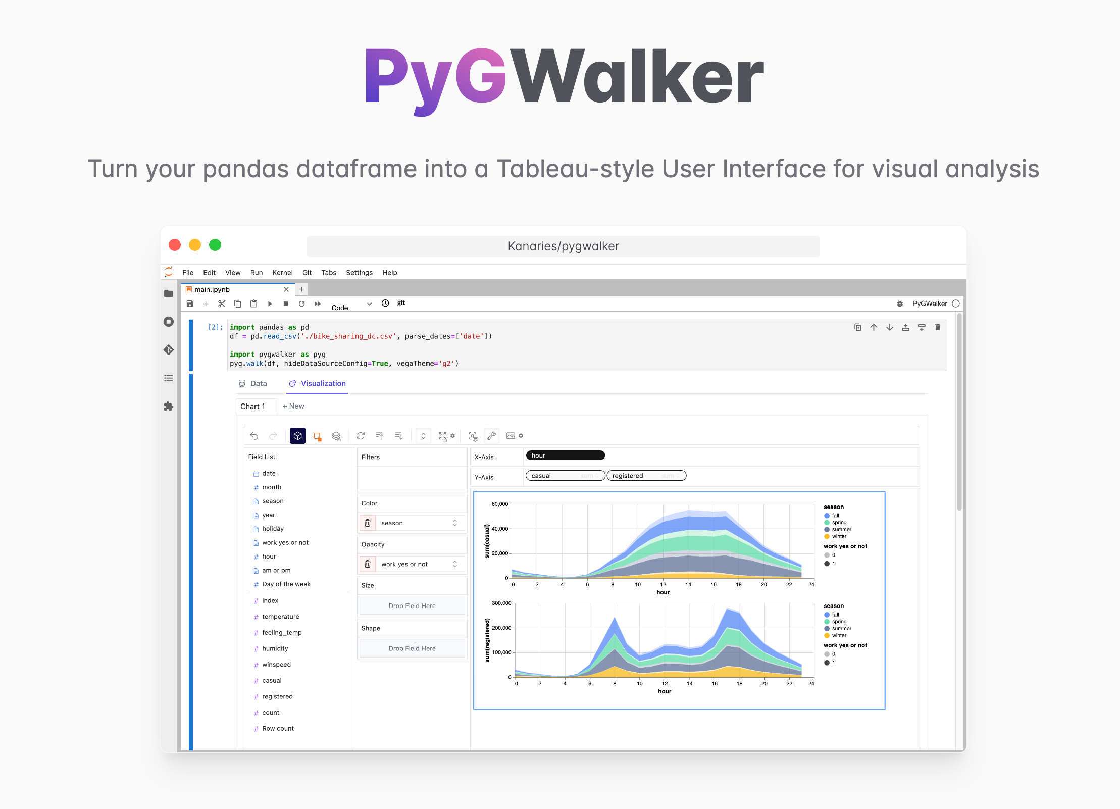
PyGWalker is a Python library for Exploratory Data Analysis with Visualization. PyGWalker (opens in a new tab) can simplify your Jupyter Notebook data analysis and data visualization workflow, by turning your pandas dataframe (and polars dataframe) into a Tableau-style User Interface for visual exploration.
What are Colormaps?
Colormaps are a vital part of Visual Data Analysis. They map data values to colors, helping our brains recognize patterns in the data. Matplotlib provides a variety of build-in colormaps, ranging from sequential colormaps, diverging colormaps, qualitative colormaps, to cyclic colormaps. But sometimes, these might not suffice. That's where custom colormaps come into play.
Creating Custom Colormaps
Understanding Colormap Types
Before we learn how to create new colormaps, it's essential to understand the different types of colormaps available. This will help us modify colormaps effectively.
-
Sequential Colormaps: These colormaps vary smoothly in lightness and often in hue. They are ideal for representing continuous, ordered data. Popular examples include the 'Hot Colormap' and 'Rdbu Colormap'. Check out how to modify these here.
-
Diverging Colormaps: These colormaps vary in lightness and possibly hue, in two different directions. They are useful when the data has a median value that is significant (zero, for example).
-
Qualitative Colormaps: These are often used for categorical data as they vary rapidly in hue.
-
Cyclic Colormaps: These colormaps are used for data that wrap around at the endpoints, such as phase angle, wind direction, or time of day.
Generating a Random Dataset
Let's start by generating a random dataset using the pandas library. This dataset will help us visualize the impact of our custom colormaps. Learn how to generate a random dataset here.
Creating Custom Colormaps in Matplotlib
Creating custom colormaps in Matplotlib is straightforward. You can define a colormap from a list of colors (specified in any Matplotlib colors format), and the colors will be evenly spaced in the colormap. Here is how you can create a colormap that transitions from red to blue:
import matplotlib.pyplot as plt
import numpy as np

cmap = plt.cm.colors.ListedColormap(['red', 'blue'])
Modifying Existing Colormaps
You can also modify existing colormaps using the Colormap class in Matplotlib. You can create a new colormap from an existing one by using the get_cmap function, and then modify the RGBA color directly. You can learn more about this here.
Visualizing Data with Custom Colormaps
Now that we have a custom colormap, let's visualize our data. We will use subplots to compare our custom colormap with a default one. You can learn more about creating subplots
here.
fig, axs = plt.subplots(2)

# Using the default colormap
img1 = axs[0].imshow(data, cmap='viridis')
fig.colorbar(img1, ax=axs[0], orientation='vertical')
axs[0].set_title('Default Colormap')

# Using the custom colormap
img2 = axs[1].imshow(data, cmap=cmap)
fig.colorbar(img2, ax=axs[1], orientation='vertical')
axs[1].set_title('Custom Colormap')

plt.show()
In the above code, imshow is used to display data as an image where the color intensity is based on the data values. The colorbar function adds a colorbar to our subplots, and the set_title function sets the title for our subplots.
Beyond Matplotlib: Seaborn, Plotly, and More
While Matplotlib is a powerful library, it's not the only one out there for data visualization in Python. Libraries like Seaborn and Plotly also offer great features and even integrate well with Matplotlib. Seaborn, for instance, is built on top of Matplotlib and introduces additional plot types. It also makes your plots look better by default. Plotly, on the other hand, specializes in creating interactive plots. More details on these libraries can be found here.
Conclusion
In the realm of data visualization, the control and customization of colors hold a prominent place. Understanding and using colormaps effectively can significantly enhance your visual data analysis. Remember, the choice of colormap can either highlight the important aspect of your data or mislead the interpretation.
We hope this guide has given you valuable insights into creating, modifying, and effectively using custom colormaps in Matplotlib. As you continue your journey in data science and machine learning, such skills will prove to be invaluable assets. For more tutorials on pandas and other Python topics, do visit our tutorial index.
