Beginner's Guide to Using Matplotlib's PyPlot Figure
Published on
Matplotlib is a popular Python plotting library that provides developers with a wide range of visualization capabilities. One of the essential modules in Matplotlib is PyPlot, a collection of functions that serve as a MATLAB-like interface for creating a variety of charts and graphs.
In this guide, we will explore PyPlot Figure, one of the most commonly used functions in Matplotlib's PyPlot library. We will provide you with a step-by-step tutorial to create different types of charts and graphs, customize their attributes, and save and share your plots with others.
Want to quickly create Data Visualizations in Python?
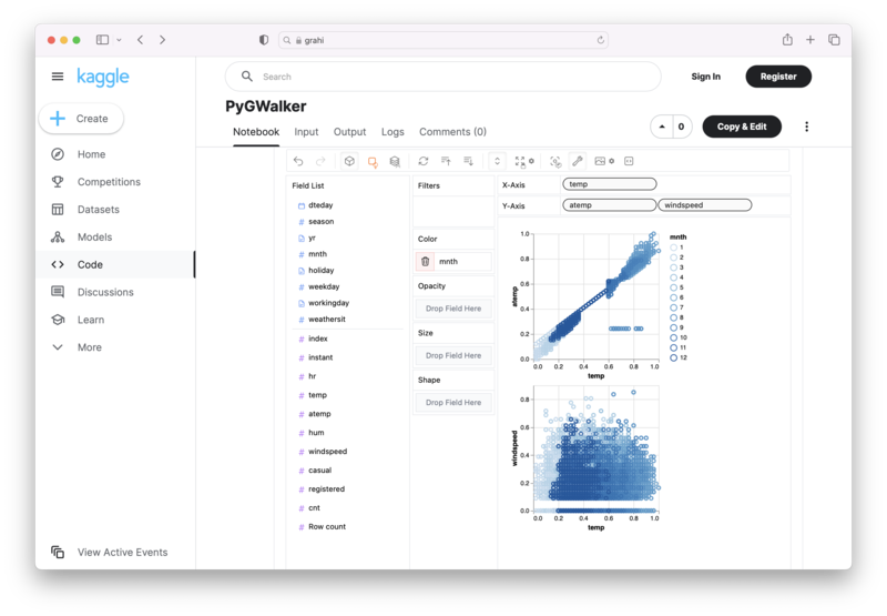
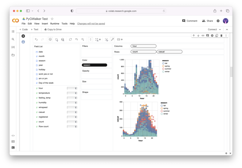
PyGWalker is an Open Source Python Project that can help speed up the data analysis and visualization workflow directly within a Jupyter Notebook-based environments.
PyGWalker (opens in a new tab) turns your Pandas Dataframe (or Polars Dataframe) into a visual UI where you can drag and drop variables to create graphs with ease. Simply use the following code:
pip install pygwalker
import pygwalker as pyg
gwalker = pyg.walk(df)
You can run PyGWalker right now with these online notebooks:
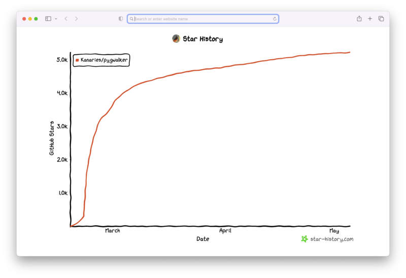
And, don't forget to give us a ⭐️ on GitHub!
What is PyPlot Figure?
PyPlot Figure is a function in Matplotlib's PyPlot that creates a new figure window and sets it as the current figure. You can use this object to plot different types of charts and graphs, set their attributes, and customize them as per your data visualization requirements.
This function provides a wide range of arguments that help you modify the properties of the figure object, such as the dimensions of the figure, the title of the plot, the color of the background, and so on.
How to use PyPlot Figure
To use PyPlot Figure, you first need to import the Matplotlib library into your code. You can do this using the following command:
import matplotlib.pyplot as pltOnce you have imported the Matplotlib library, you can use the PyPlot Figure function as follows:
plt.figure()This will create a new figure window with default settings. If you want to customize the attributes of the figure, you can use the various arguments offered by the function. For example, you can set the dimensions of the figure using the figsize argument as follows:
plt.figure(figsize=(10, 5))This will create a new figure with a size of 10 inches by 5 inches.
Different types of PyPlot Figure Charts
Once you have created a new figure window using the PyPlot Figure function, you can plot various types of charts and graphs using other functions in Matplotlib's PyPlot. Here are some of the most commonly used functions and their corresponding charts:
Line Chart
You can create a line chart using the plt.plot() function in Matplotlib's PyPlot. Here's an example:
x = [1, 2, 3, 4]
y = [10, 20, 30, 40]

plt.plot(x, y)
plt.title("Line Chart")
plt.xlabel("X-axis label")
plt.ylabel("Y-axis label")
plt.show()
This will create a simple line chart with x and y axes labels.
Bar Chart
You can create a bar chart using the plt.bar() function in Matplotlib's PyPlot. Here's an example:
x = [1, 2, 3, 4]
y = [10, 20, 30, 40]

plt.bar(x, y)
plt.title("Bar Chart")
plt.xlabel("X-axis label")
plt.ylabel("Y-axis label")
plt.show()
This will create a simple bar chart with x and y axes labels.
Scatter Plot
You can create a scatter plot using the plt.scatter() function in Matplotlib's PyPlot. Here's an example:
x = [1, 2, 3, 4]
y = [10, 20, 30, 40]

plt.scatter(x, y)
plt.title("Scatter Plot")
plt.xlabel("X-axis label")
plt.ylabel("Y-axis label")
plt.show()
This will create a simple scatter plot with x and y axes labels.
Pie Chart
You can create a pie chart using the plt.pie() function in Matplotlib's PyPlot. Here's an example:
sizes = [30, 40, 10, 20]
labels = ['A', 'B', 'C', 'D']

plt.pie(sizes, labels=labels)
plt.title("Pie Chart")
plt.show()
This will create a simple pie chart with customized labels.
Histogram
You can create a histogram using the plt.hist() function in Matplotlib's PyPlot. Here's an example:
data = [10, 20, 30, 10, 20, 30, 40, 50, 60]

plt.hist(data)
plt.title("Histogram")
plt.xlabel("Value")
plt.ylabel("Frequency")
plt.show()
This will create a simple histogram with value and frequency labels.
These are just some examples of the types of charts that you can create using PyPlot Figure in Matplotlib's PyPlot. You can use other functions in the library to create many other charts and graphs as per your visualization requirements.
Customize PyPlot Figure Charts
In addition to creating different types of charts and graphs, you can customize their attributes using various arguments in Matplotlib's PyPlot. Here are some of the most commonly used arguments:
Title
You can set the title of the plot using the plt.title() function. For example:
plt.title("My Plot Title")Labeling Axes
You can label the x and y axes using the plt.xlabel() and plt.ylabel() functions, respectively. For example:
plt.xlabel("X-axis label")
plt.ylabel("Y-axis label")
Background Color
You can set the color of the plot's background using the plt.figures() function and its facecolor argument. For example:
plt.figure(facecolor='lightgray')Grid Lines
You can turn on the grid lines in the plot using the plt.grid() function and its True argument. For example:
plt.grid(True)Legends
You can add legends to the plot using the plt.legend() function and its loc argument. For example:
plt.legend(loc='upper right')Save PyPlot Figure Charts to File
Once you have created and customized your plot, you may want to save it to a file for sharing and archival purposes. Matplotlib's PyPlot library offers several options to save plots to different types of file formats, such as PNG, PDF, SVG, and more.
You can use the plt.savefig() function to save the plot to a file. For example:
plt.savefig('plot.png')This will save the plot as a PNG file in the current working directory.
Conclusion
In conclusion, PyPlot Figure is an essential function in Matplotlib's PyPlot library that creates a new figure window and sets it as the current figure. You can use this object to plot different types of charts and graphs, customize their attributes, and save and share your plots with others.
In this guide, we provided you with a step-by-step tutorial to create different types of charts and graphs, customize their attributes, and save and share your plots with others. We hope that you found this guide helpful and that it provided you with the knowledge and resources to master PyPlot Figure in Matplotlib's PyPlot. If you're interested in learning more about data visualization and analysis with Python, check out our other guides and tutorials on Pandas and PySpark.
Other Python Tutorials:


