Mastering Matplotlib: Setting the Y-Axis Range Precisely
- Name
- Sebastian Brandt
Published on
Are you battling to set the limits of the y-axis in matplotlib? Are you frustrated with the automatic y-axis range and yearn for a way to set it according to your needs? If so, you're in the right place! This comprehensive guide on "how to set the y-axis range in matplotlib" will put you in the driver's seat and give you complete control over your plot's y-axis.
Before diving in, let's understand the importance of setting the y-axis range in matplotlib. It isn't just about visual appeal—setting the y-axis range correctly is crucial for the integrity of your data representation. A poorly scaled y-axis can distort data trends and mislead viewers. Thus, knowing how to manually set the y-axis range will not only enhance the quality of your plots but also improve the clarity and accuracy of your data presentation.
Deciphering Matplotlib: The Y-Axis Range
To begin, let's clarify the role of the y-axis in matplotlib. In most 2D plots, the y-axis represents the dependent variable—the variable that changes in response to the independent variable plotted on the x-axis. The y-axis range, therefore, defines the lower and upper limits of this dependent variable on the plot.
The most straightforward way to set the y-axis range is by using the ylim() function from matplotlib's pyplot module. This function allows you to specify the lower and upper limits of the y-axis as arguments. Here's a simple example:
import matplotlib.pyplot as plt

plt.plot([0, 1, 2, 3, 4], [0, 1, 4, 9, 16])
plt.ylim(0, 20)
plt.show()
In this example, we've plotted a simple quadratic function and set the y-axis range from 0 to 20 with plt.ylim(0, 20).
Matplotlib Y-Axis Range: Using Axes Objects for More Control
While plt.ylim() is great for simple plots, for more complex plots, you might need finer control over your y-axis range. This is where matplotlib's object-oriented API shines.
Instead of working with the pyplot module, you can create an Axes object directly and work with that. Each Axes object comes with a host of methods that you can use to customize your plot, including methods to set the y-axis range: set_ylim() and set_ybound().
Here's an example of how to set the y-axis range using an Axes object:
fig, ax = plt.subplots()

ax.plot([0, 1, 2, 3, 4], [0, 1, 4, 9, 16])
ax.set_ylim(0, 20)
plt.show()
In this example, we first create a Figure and an Axes object with plt.subplots(). We then plot the quadratic function on the Axes object with ax.plot(). Finally, we set the y-axis range with ax.set_ylim(0, 20).
Dynamic Y-Axis Range: Adjusting Y-Axis Limits on the Fly
Sometimes, you might want to adjust the y-axis range based on the data or some other criteria. For this,
matplotlib provides functions that let you fetch the current y-axis range, which you can then modify as needed. The key functions here are get_ylim(), set_ylim(), get_ybound(), and set_ybound().
Here's an example of how to dynamically set the y-axis range:
fig, ax = plt.subplots()

ax.plot([0, 1, 2, 3, 4], [0, 1, 4, 9, 16])
ymin, ymax = ax.get_ylim()
ax.set_ylim(ymin, ymax*1.1)
plt.show()
In this example, we first fetch the current y-axis range with ax.get_ylim(). We then set a new y-axis range that extends the current maximum by 10% with ax.set_ylim(ymin, ymax*1.1).
These are the primary ways to set the y-axis range in matplotlib. However, matplotlib's versatility allows for numerous other approaches, which we'll delve into in the following sections.
Getting Adventurous: Beyond the Basics of Y-Axis Range
Matplotlib also offers more advanced functionality for setting the y-axis range. This can be particularly useful when dealing with multi-panel figures, when you need to apply the same y-axis range across multiple subplots, or when you want to dynamically adjust the y-axis range based on the data.
Setting the Same Y-Axis Range for Multiple Subplots
If you're creating a multi-panel figure with several subplots, you might want to use the same y-axis range for all subplots to ensure consistency. You can do this easily by looping through all Axes objects and setting the y-axis range for each one. Here's how:
fig, axs = plt.subplots(2, 2)
for ax in axs.flat:
    ax.set_ylim(0, 20)
plt.show()
In this example, we first create a 2x2 grid of subplots with plt.subplots(2, 2). We then loop through all Axes objects in the resulting array and set the y-axis range for each one with ax.set_ylim(0, 20).
Dynamically Adjusting the Y-Axis Range Based on Data
Another advanced technique is to adjust the y-axis range based on the data itself. For example, you might want to set the y-axis range to span from the minimum to the maximum value in your data set. Here's an example of how to do this:
data = [0, 1, 4, 9, 16]
fig, ax = plt.subplots()
ax.plot([0, 1, 2, 3, 4], data)
ax.set_ylim(min(data), max(data))
plt.show()
In this example, we first define a list of data points. We then create a Figure and an Axes object, plot the data on the Axes object, and set the y-axis range to span from the minimum to the maximum value in the data set.
Alternative to Matplotlib: Visualize Data with PyGWalker
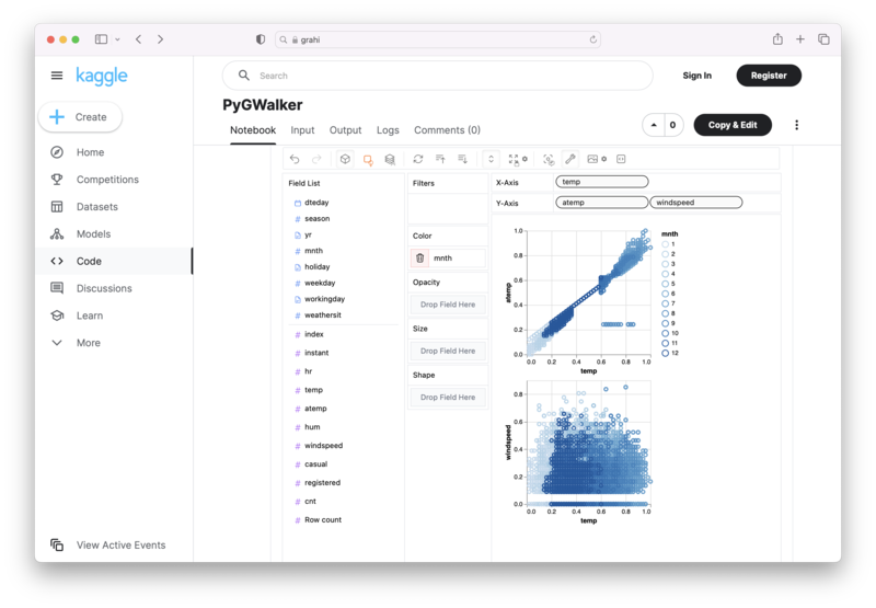
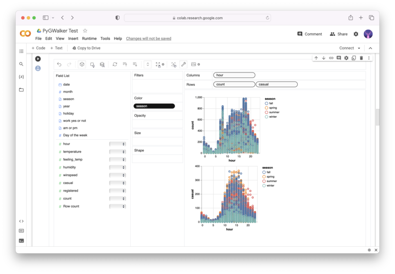
Besides using Matplotlib to visualize your pandas dataframe, here is an alternative, Open Source python library that can help you create data visualization with ease: PyGWalker (opens in a new tab).

No need to complete complicated processing with Python coding anymore, simply import your data, and drag and drop variables to create all kinds of data visualizations! Here's a quick demo video on the operation:
Here's how to use PyGWalker in your Jupyter Notebook:
pip install pygwalker
import pygwalker as pyg
gwalker = pyg.walk(df)
Alternatively, you can try it out in Kaggle Notebook/Google Colab:
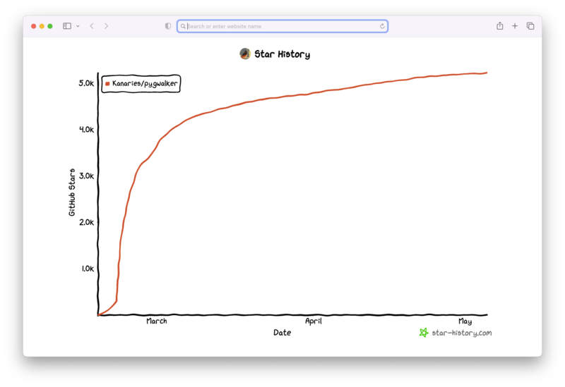
PyGWalker is built on the support of our Open Source community. Don't forget to check out PyGWalker GitHub (opens in a new tab) and give us a star!
Frequently Asked Questions
1. What is the difference between ylim() and set_ylim() in matplotlib?
ylim() is a function from matplotlib's pyplot module that you can use to set the y-axis range for the current plot. set_ylim(), on the other hand, is a method of the Axes class in matplotlib's object-oriented API that you can use to set the y-axis range for a specific Axes object.
2. How do I set the y-axis range to automatically adjust based on the data?
You can use the autoscale() method of the Axes class to automatically scale the y-axis range based on the data. For even more control, you can use the get_ylim() method to fetch the current y-axis range, and then adjust it as needed before setting it with set_ylim().
3. Can I set the y-axis range for multiple subplots at once?
Yes, you can set the y-axis range for multiple subplots at once by looping through all Axes objects and setting the y-axis range for each one.