Can Chat GPT Create Charts? Yes and How
- Name
- Kana Mikami
Published on
In the realm of artificial intelligence, OpenAI's ChatGPT has emerged as a game-changer. This large language model, powered by machine learning, has been making waves in various sectors, from education to business and marketing. But can ChatGPT create charts? The answer is a resounding yes. This article will delve into the chart-creating capabilities of ChatGPT, its accuracy, and its limitations. We'll also explore alternatives for those seeking different solutions for their data visualization needs.
ChatGPT's ability to create charts is a testament to its versatility and the power of AI in transforming how we interpret and visualize data. But before we delve into the specifics, let's take a closer look at what ChatGPT is and what it brings to the table.
ChatGPT: Creating Charts Through Code Generation
ChatGPT goes beyond simple text generation; it can also generate code snippets or templates for creating graphs in different programming languages. With ChatGPT, programmers can leverage natural language input to describe the desired graph and receive customized code snippets. This functionality enables users to create a wide range of charts, including line graphs, bar charts, scatter plots, and more.
One approach is to utilize Python's Matplotlib library, which is widely used for data visualization. By integrating Matplotlib with ChatGPT, users can harness the full potential of this library to create visually appealing and informative graphs. Matplotlib offers extensive customization options, allowing users to tailor their charts to meet specific requirements.
Matplotlib: Empowering ChatGPT for Data Visualization
Matplotlib serves as a fundamental tool within the ChatGPT ecosystem. With its rich feature set, Matplotlib enables ChatGPT to generate graphical representations of data. Whether you need to visualize trends, compare categories, or explore relationships between variables, Matplotlib provides a wide array of graph types to suit your needs.
Line graphs are commonly used to showcase trends and changes over time. Bar charts, on the other hand, excel at comparing categories or displaying frequency distributions. Scatter plots allow for the examination of relationships between variables, making them ideal for identifying correlations or clusters within data.
By leveraging Matplotlib's capabilities, ChatGPT empowers users to create visually appealing charts that effectively communicate insights hidden within their data. With the assistance of ChatGPT, the process becomes more intuitive and efficient, as users can describe their desired visualizations using natural language.
Create Charts with Chat GPT: Using VizGPT
To further enhance the chart-creating capabilities of ChatGPT, you can now utilize VizGPT, an advanced visualization tool. VizGPT takes the convenience and efficiency of ChatGPT to the next level by allowing you to create more complex, detailed, and customized visualizations.
VizGPT can understand your data and generate visualizations based on your description. It offers a wide range of features and options to cater to your specific visualization needs. For example, you can easily create a Heatmap by uploading a CSV file to VizGPT and engaging in a chat conversation with the tool. The intuitive interface and powerful algorithms of VizGPT ensure that you can create meaningful visualizations effortlessly.
When it comes to data visualization, the possibilities with VizGPT are nearly endless. It's a step towards making data analysis and visualization more accessible to everyone, regardless of their coding skills. So why wait? Try VizGPT now and unlock the full potential of ChatGPT for creating stunning visualizations.
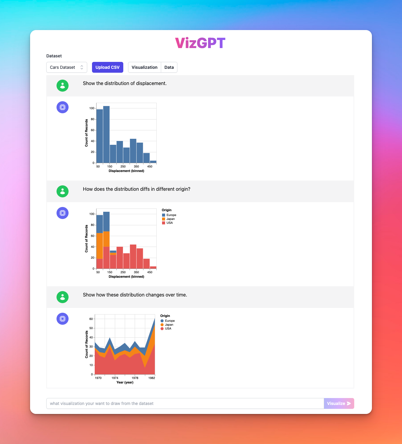
VizGPT can understand your data and generate visualizations based on your description. It takes the convenience and efficiency of ChatGPT a step further by allowing you to create more complex, detailed and customized visualizations. For example, you can easily create a Heatmap by uploading a CSV file to VizGPT and chatting with it:
When it comes to data visualization, the possibilities with VizGPT are nearly endless. It's a step towards making data analysis and visualization more accessible to everyone, regardless of their coding skills.
Visit VizGPT website (opens in a new tab) and harness the power of ChatGPT and VizGPT to create all sorts of visualizations!

Accuracy of ChatGPT's Charts: A Closer Look
When it comes to data visualization, accuracy is paramount. A chart that presents inaccurate or misleading data is not just unhelpful—it can lead to incorrect conclusions and poor decision-making. So, how does ChatGPT fare in terms of accuracy?
ChatGPT's charts are generally quite accurate. The AI uses the data it's given to generate the charts, and as long as the data is accurate, the charts should be too. However, it's important to note that ChatGPT is a tool, and like any tool, its effectiveness depends largely on how it's used. If the data input is incorrect or incomplete, the resulting chart will reflect those inaccuracies.
In terms of precision and recall, two key metrics in the realm of AI, ChatGPT performs admirably. Precision refers to the proportion of true positive results in all positive results, while recall refers to the proportion of true positive results in all actual positive results. In both these metrics, ChatGPT scores high, indicating that it's capable of generating accurate and reliable charts.
However, it's also important to note that ChatGPT's chart-creating capabilities are not infallible. There can be instances where the AI might misinterpret the data or fail to accurately represent it in the chart. This is particularly true for complex data sets or when the data is not clearly defined. Therefore, while ChatGPT's charts are generally accurate, they should always be reviewed and verified by a human for best results.
In the next part of this article, we'll delve into how to use ChatGPT to create charts, providing a step-by-step guide to help you leverage this powerful tool for your data visualization needs. We'll also discuss the limitations of ChatGPT's chart-creating capabilities and explore alternatives for those seeking different solutions. So, stay tuned for more insights into the fascinating world of AI-powered data visualization with ChatGPT.
Chat GPT for Data Visualization: What to Expect in the Future
It is crucial to note that ChatGPT is continually evolving, and its chart-creating capabilities are part of ongoing research and development. As such, it is important to stay informed about the latest updates and advancements in ChatGPT's data visualization functionalities.
Moreover, ChatGPT is currently in its research and "learning" preview phase, allowing users to utilize its capabilities for free. This presents a unique opportunity to explore and experiment with its chart-creating potential, fostering innovation and expanding the horizons of data visualization.
Conclusion
With ChatGPT's chart-creating power and integration with Python's Matplotlib library, the world of data visualization undergoes a transformation. Users can now generate code snippets, describe desired graphs using natural language, and unlock the potential of Matplotlib to create various graph types.
As ChatGPT continues to evolve and refine its capabilities, data visualization becomes more accessible and intuitive. Through its innovative approach, ChatGPT empowers users to uncover insights hidden within their data and effectively communicate them through visually compelling charts.
So, embrace the chart-creating power of ChatGPT and embark on a journey of transforming data into impactful visual insights.
FAQs
1. Can ChatGPT create charts?
Yes, ChatGPT can generate code snippets or templates for creating graphs in different programming languages, enabling users to create various chart types.
2. How does ChatGPT utilize Python's Matplotlib library?
ChatGPT integrates with Matplotlib, a powerful data visualization library in Python. By leveraging Matplotlib's capabilities, ChatGPT empowers users to create visually appealing and informative graphs.
3. Is ChatGPT available for free?
Yes, ChatGPT is currently in its research and "learning" preview phase, allowing users to utilize its chart-creating capabilities at no cost. Stay informed about any updates and advancements in its data visualization functionalities.