Pandas Visulziation: A Step-by-Step Tutorial
- Name
- Rajiv Chandra
Published on
Python's Pandas library is a powerhouse tool that data scientists and analysts across the globe use daily. One of its most compelling features is its robust data visualization capabilities. This article will guide you through the process of creating compelling plots using Pandas, providing you with the skills needed to turn raw data into insightful charts.
Pandas plotting is not just about making your data look pretty. It's about unlocking the stories hidden within the numbers. Whether you're exploring a new dataset or preparing to share your latest findings, visualizations are key to communicating data-driven insights.
Absolutely, let's dive deeper into each segment with more detailed explanations and sample code snippets.
Use Plot Function for Pandas Visulziation
Pandas provides a high-level, flexible, and efficient data structure called DataFrame, which is extremely conducive to visualization. With the .plot() function, you can generate a variety of plots such as line, bar, scatter, and more. This function is a wrapper over the versatile Matplotlib library, making it easier to create complex visualizations.
For instance, if you're just starting your journey with Pandas, you'll soon be creating basic line plots that can reveal valuable trends in your data. Line plots are excellent for showcasing data over time, making them perfect for time-series data analysis.
Here's a simple example of how to create a line plot with Pandas:
import pandas as pd
import numpy as np

# Create a DataFrame
df = pd.DataFrame({
   'A': np.random.rand(10),
   'B': np.random.rand(10)
})

df.plot(kind='line')
In this code, we first import the necessary libraries. We then create a DataFrame with two columns, each filled with random numbers. Finally, we use the .plot() function to create a line plot.
But what if you want to use a visual UI for plotting Pandas Dataframes with no code? Well, fortunately there is a Pandas Dataframe that can help you solve the issue:
Use PyGWalker for Pandas Visulziation
PyGWalker is a Python Library that designs for Exploatory Data Analysis and Easy Data Visualization. Think about it as running an Open Source Tableau within your Jupyter Notebook. You can easily create Visuzlaition by Dragging and Dropping variables instead of checking up complex coding tutorials:
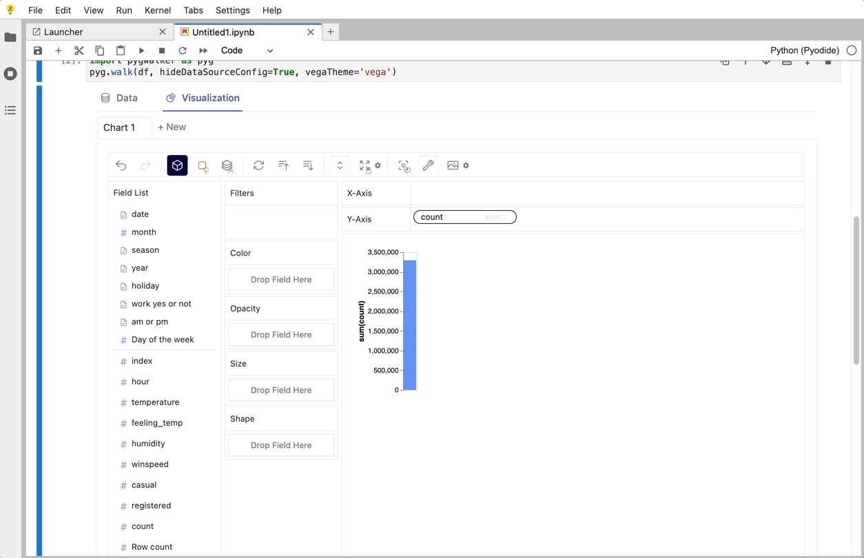
Here is how you can quickly get started:
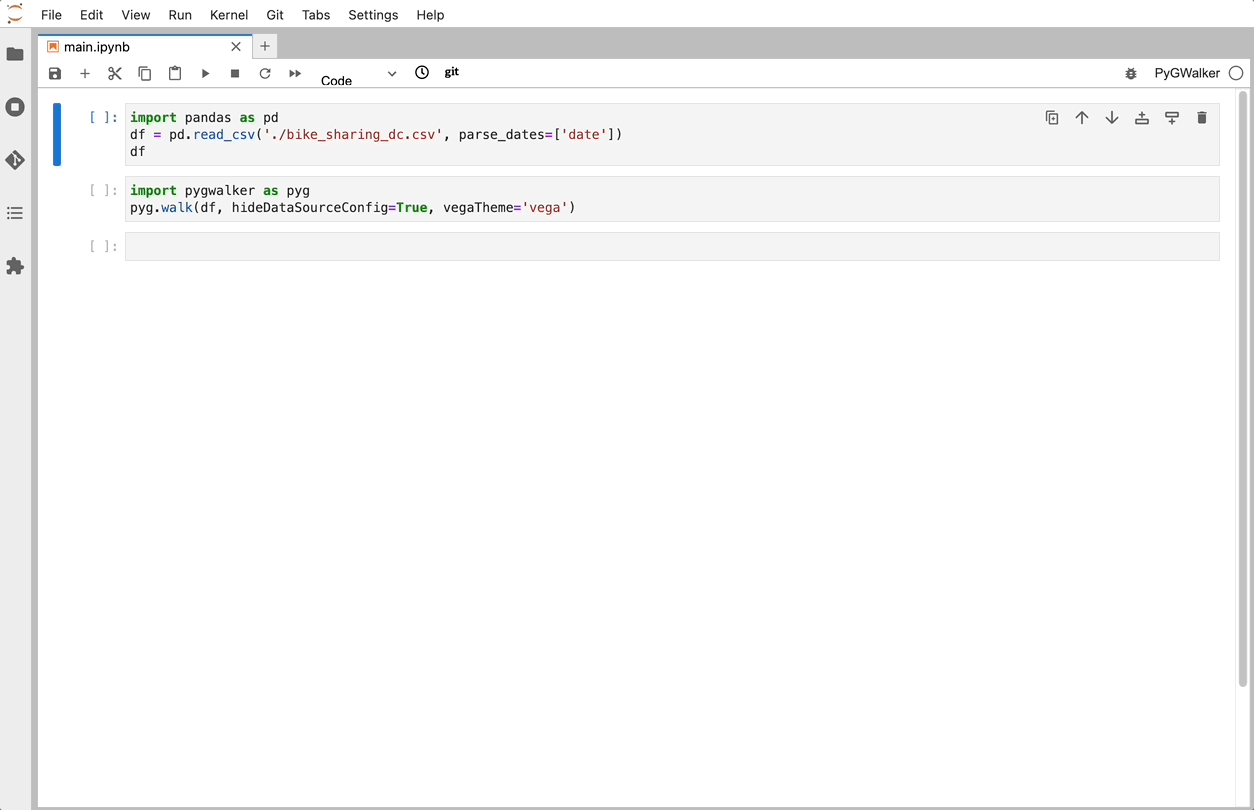
Import pygwalker and pandas to your Jupyter Notebook to get started.
import pandas as pd
import pygwalker as pyg
You can use pygwalker without breaking your existing workflow. For example, you can call up Graphic Walker with the dataframe loaded in this way:
df = pd.read_csv('./bike_sharing_dc.csv', parse_dates=['date'])
gwalker = pyg.walk(df)
And you can use pygwalker with polars (since pygwalker>=0.1.4.7a0):
import polars as pl
df = pl.read_csv('./bike_sharing_dc.csv',try_parse_dates = True)
gwalker = pyg.walk(df)
Now you have loaded your Pandas Dataframe for Visualizing.
That's it. Now you have a Tableau-like user interface to analyze and visualize data by dragging and dropping variables.
PyGWalker is supported by an active community of developers and data scientists. Visit PyGWalker GitHub (opens in a new tab) and leave it a ⭐️!
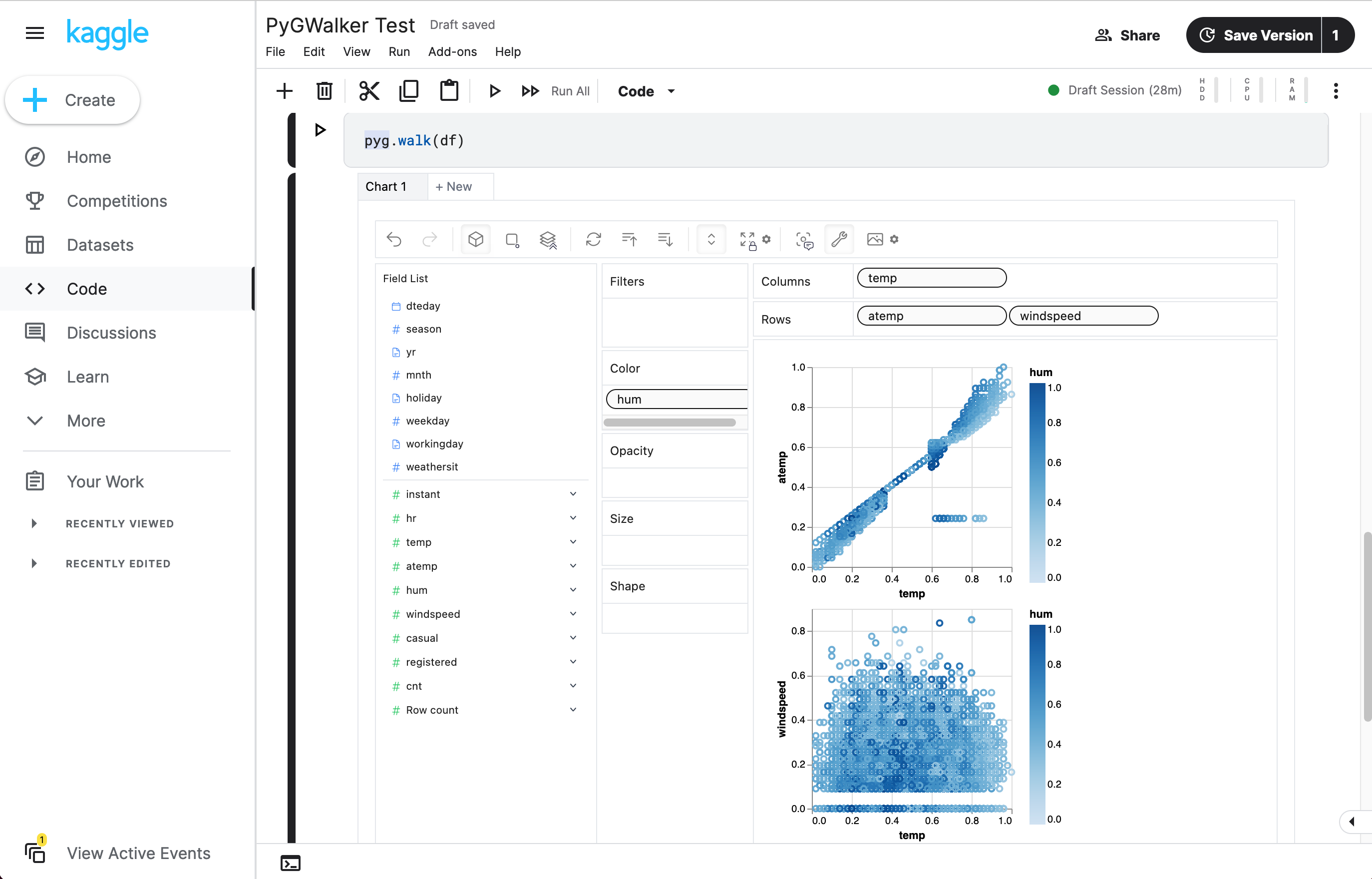
You can try PyGWalker with Google Colab or Kaggle Notebook right now:
| Run in Kaggle (opens in a new tab) | Run in Colab (opens in a new tab) |
|---|---|
 (opens in a new tab) (opens in a new tab) | 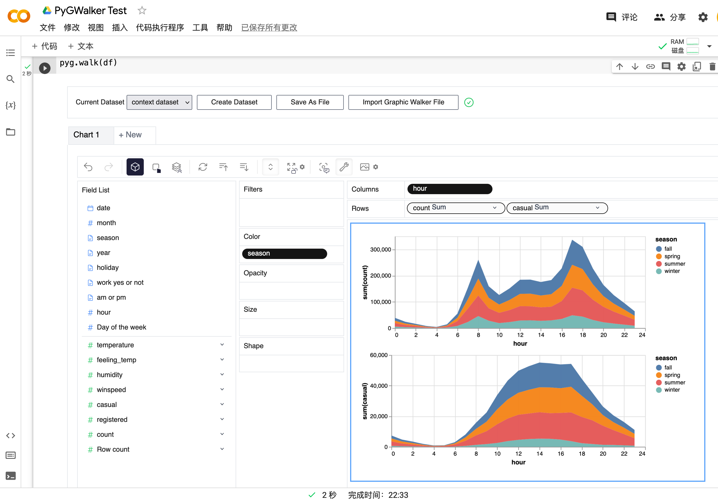 (opens in a new tab) (opens in a new tab) |
Diving into Different Plot Types
Pandas offers a variety of plot types, each suited to different kinds of data and different questions. For example, histograms are great for getting an overview of your data's distribution, while scatter plots can help you discover correlations between different data points.
Each plot type in Pandas comes with a set of parameters that you can tweak to customize your visualization. Understanding these parameters and when to use them can greatly enhance your ability to create meaningful visualizations.
Here's how you can create a histogram and a scatter plot:
# Histogram
df['A'].plot(kind='hist')

# Scatter plot
df.plot(kind='scatter', x='A', y='B')
In the first plot, we're creating a histogram of the 'A' column. In the second plot, we're creating a scatter plot with 'A' on the x-axis and 'B' on the y-axis.
Handling Categorical Data with Pandas
Categorical data is a common type of data that you'll encounter in many datasets. Pandas provides several powerful tools for visualizing this kind of data. For instance, bar plots can help you compare different categories, while pie plots are excellent for visualizing the ratios between categories.
Moreover, Pandas allows you to group your data based on categories, which can be incredibly useful when you want to aggregate your data and draw insights at the category level.
Here's an example of how to create a bar plot and a pie plot:
# Create a DataFrame with categorical data
df = pd.DataFrame({
   'Fruit': ['Apple', 'Banana', 'Cherry', 'Apple', 'Cherry', 'Banana', 'Apple', 'Cherry', 'Banana', 'Apple'],
   'Count': np.random.randint(1, 10, 10)
})

# Bar plot
df.groupby('Fruit')['Count'].sum().plot(kind='bar')

# Pie plot
df.groupby('Fruit')['Count'].sum().plot(kind='pie')
In this code, we first create a DataFrame with categorical data. We then group the data by the 'Fruit' column and sum the 'Count' for each fruit. Finally, we create a bar plot and a pie plot of the summed counts.
Customizing Your Plots
One of the most powerful features of Pandas visualization is the ability to customize your plots. This includes changing the color and style of your plots, adding labels and titles, and much more.
Here's an example of how to customize a line plot:
# Create a DataFrame
df = pd.DataFrame({
   'A': np.random.rand(10),
   'B': np.random.rand(10)
})

# Create a line plot with customizations
df.plot(kind='line',
        color=['red', 'blue'],
        style=['-', '--'],
        title='My Line Plot',
        xlabel='Index',
        ylabel='Value')
In this code, we first create a DataFrame with two columns, each filled with random numbers. We then create a line plot and customize it by setting the color and style of the lines, and adding a title and labels for the x and y axes.
Handling More Complex Data Structures
Pandas is not limited to handling simple data structures. It can also handle more complex data structures such as multi-index DataFrames and time series data.
Here's an example of how to create a line plot from a multi-index DataFrame:
# Create a multi-index DataFrame
index = pd.MultiIndex.from_tuples([(i,j) for i in range(5) for j in range(5)])
df = pd.DataFrame({
   'A': np.random.rand(25),
   'B': np.random.rand(25)
}, index=index)

# Create a line plot
df.plot(kind='line')
In this code, we first create a multi-index DataFrame with two columns, each filled with random numbers. We then create a line plot from this DataFrame.
Advanced Visualization with Seaborn
While Pandas provides a solid foundation for data visualization, sometimes you might need more advanced tools. Seaborn is a Python data visualization library based on Matplotlib that provides a high-level interface for creating beautiful, informative visualizations.
Here's an example of how to create a Seaborn plot from a Pandas DataFrame:
import seaborn as sns

# Load your DataFrame
df = pd.read_csv('bikesharing_dc.csv', parse_dates=['date'])

# Create a Seaborn plot
sns.lineplot(data=df, x='date', y='count')
In this code, we first import the Seaborn library. We then load a DataFrame and create a line plot with the 'date' column on the x-axis and the 'count' column on the y-axis.
Interactive Visualization with Plotly
For interactive visualizations, Plotly is a great choice. Plotly is a Python graphing library that makes interactive, publication-quality graphs.
Here's an example of how to create a Plotly plot from a Pandas DataFrame:
import plotly.express as px

# Load your DataFrame
df = pd.read_csv('bikesharing_dc.csv', parse_dates=['date'])

# Create a Plotly plot
fig = px.line(df, x='date', y='count')
fig.show()
In this code, we first import the Plotly Express module. We then load a DataFrame and create a line plot with the 'date' column on the x-axis and the 'count' column on the y-axis. The fig.show() command displays the interactive plot.
Conclusion
Pandas is a powerful tool for data analysis and visualization in Python. With its robust plotting capabilities and compatibility with other visualization libraries like Matplotlib, Seaborn, Plotly, and PyGWalker, you can create a wide range of visualizations to gain insights from your data. Whether you're a beginner just starting out or an experienced data scientist, mastering Pandas visualization is a valuable skill that will enhance your data analysis workflow.
FAQs
-
What is Pandas in Python?
- Pandas is a software library written for the Python programming language for data manipulation and analysis. It provides data structures and functions needed to manipulate structured data.
-
How is Pandas used for data visualization?
- Pandas provides data visualization by allowing the use of its plot() function and various plotting methods to plot data directly off DataFrame and Series objects.
-
What are some of the most popular Pandas visualization libraries?
- Some of the most popular libraries for data visualization in Pandas include Matplotlib, Seaborn, Plotly, and PyGWalker. These libraries provide a variety of tools and functionalities for creating static, animated, and interactive plots in Python.