How to Create an Interactive Plot with Matplotlib
- Name
- Rajiv Chandra
Published on
Creating standard static plots using Python and Matplotlib is a well-trodden path, with plenty of guides and resources available. However, when it comes to creating interactive plots - graphs that you can zoom, pan, and update in real time - the information can be a bit sparse.
In this comprehensive guide, we will demystify the process of creating interactive plots with Matplotlib. We'll walk you through some step-by-step examples, ensuring you have all the necessary skills to create your own interactive visualizations.
Getting Started with Interactive Plots in Matplotlib
Before we begin, it's important to understand what an interactive plot is. An interactive plot, unlike a static one, allows users to interact with the data in real time. This could mean zooming in and out of a graph, updating the graph in response to widget interactions, or even creating a dynamic graph that updates in real time based on input data.
To enable interactivity in Matplotlib, we need to utilize certain backends that support interactive mode. Matplotlib's default mode is non-interactive, and all plots are static. To make a plot interactive, we need to switch to a different backend, like 'notebook' or 'widget'.
In Jupyter notebooks, you can use the %matplotlib notebook magic command to switch to the notebook backend and make your plots interactive. This is a key first step towards creating interactive plots.
Creating Your First Interactive Plot
Now that we have set the stage, let's create our first interactive plot. We'll start with a simple example: a scatter plot.
%matplotlib notebook
import matplotlib.pyplot as plt
import numpy as np

# Create a simple scatter plot
fig, ax = plt.subplots()
x, y = np.random.rand(2, 200)
scatter = ax.scatter(x, y)

plt.show()
When you run the code above in a Jupyter notebook, you'll see that your plot is interactive. You can zoom in and out using the toolbar at the bottom of the plot.
Making Interactive Plots with Widgets
The true power of interactive plots comes when you combine them with widgets. Widgets allow users to interact with the plot and control aspects of the data and visualization.
Let's take a look at an example where we create a sine wave plot and use a slider to control the frequency of the wave.
from ipywidgets import interact
import ipywidgets as widgets

def plot_func(freq):
    plt.figure()
    x = np.linspace(0, 2*np.pi, 400)
    y = np.sin(x * freq)
    plt.plot(x, y)
    plt.show()

interact(plot_func, freq=widgets.FloatSlider(value=7.5, min=1, max=10, step=0.5));
In the code snippet above, we first define a function plot_func that generates a sine wave for a given frequency. We then use the interact function from ipywidgets to create a slider that controls the frequency. When you run this code, you'll see a slider appear above your plot. As you slide the slider, the frequency of the sine wave changes in real time
.
These examples provide an introduction to creating interactive plots with Matplotlib. In the following sections, we will explore more complex examples and delve deeper into the functionalities of interactive plots.
Continuing from where we left off, let's further dive into the fascinating world of Matplotlib's interactive capabilities.
Enhancing Interactivity with Widgets
Widgets are not limited to sliders, you can use checkboxes, dropdowns, text inputs, and many others. Each type of widget can be associated with different types of data manipulation. For instance, a dropdown could be used to select which dataset to display on the plot. Widgets give you the flexibility to create truly interactive and versatile visualizations.
Updating Plots Dynamically
To update plots dynamically based on user interaction, you'll need to understand the concept of events in Matplotlib. Events are inputs from users, such as mouse clicks, key presses, or even moving the mouse over the plot. By capturing and processing these events, you can update your plots in response to user inputs.
Here's an example that illustrates how you can use a button press event to add new data points to a scatter plot:
from matplotlib.widgets import Button

fig, ax = plt.subplots()
scatter = ax.scatter(np.random.rand(10), np.random.rand(10))

button_ax = plt.axes([0.7, 0.05, 0.1, 0.075])
button = Button(button_ax, 'Add')

def add_point(event):
    new_point = np.random.rand(2)
    scatter.set_offsets(np.concatenate([scatter.get_offsets(), [new_point]]))
    plt.draw()

button.on_clicked(add_point)

plt.show()
In this code, we're creating a scatter plot and a button. When the button is clicked, it triggers the add_point function, which adds a new random data point to the scatter plot.
Interactive 3D Plots
Matplotlib also supports creating interactive 3D plots. This allows you to rotate the plot and zoom in/out to examine the data from different angles. Here's an example of a 3D scatter plot:
from mpl_toolkits.mplot3d import Axes3D

fig = plt.figure()
ax = fig.add_subplot(111, projection='3d')

x, y, z = np.random.rand(3, 100)
ax.scatter(x, y, z)

plt.show()
In this plot, you can use the mouse to drag and rotate the plot in 3D space, and use the scroll wheel to zoom in and out.
By using these techniques, you can create a wide array of interactive plots in Matplotlib. Interactive plots are a powerful tool for data analysis and visualization, as they allow you to explore your data more thoroughly and intuitively.
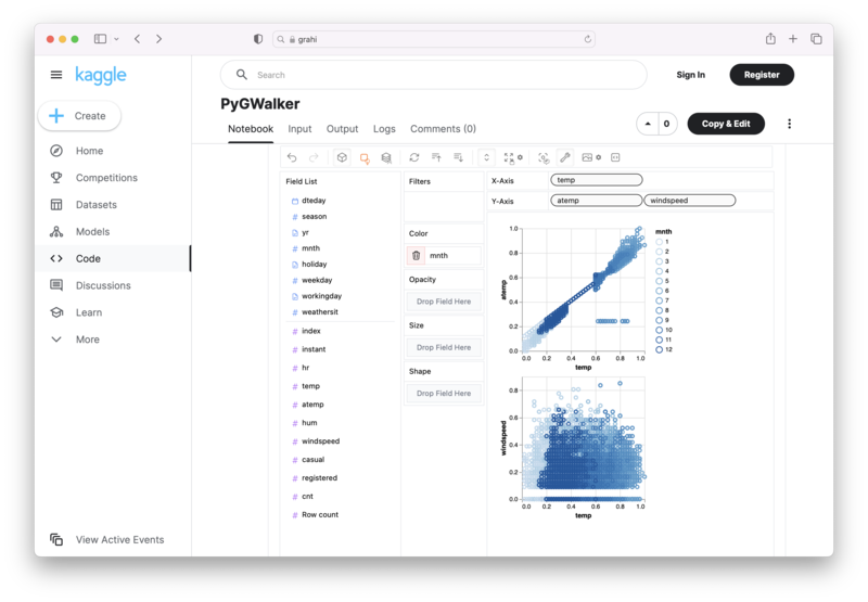
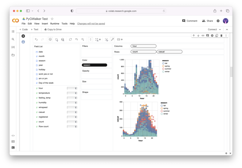
Alternative to Matplotlib: Visualize Data with PyGWalker
Besides using Matplotlib to visualize your pandas dataframe, here is an alternative, Open Source python library that can help you create data visualization with ease: PyGWalker (opens in a new tab).

No need to complete complicated processing with Python coding anymore, simply import your data, and drag and drop variables to create all kinds of data visualizations! Here's a quick demo video on the operation:
Here's how to use PyGWalker in your Jupyter Notebook:
pip install pygwalker
import pygwalker as pyg
gwalker = pyg.walk(df)
Alternatively, you can try it out in Kaggle Notebook/Google Colab:
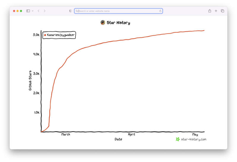
PyGWalker is built on the support of our Open Source community. Don't forget to check out PyGWalker GitHub (opens in a new tab) and give us a star!
FAQ
-
What is an interactive plot?
An interactive plot is a graph that allows users to interact with it. The users can zoom in and out, pan the graph, and even update it in real-time, depending on the implemented features. -
How can I make my Matplotlib plots interactive?
You can make your Matplotlib plots interactive by using an interactive backend like 'notebook' or 'widget'. In a Jupyter notebook, you can use the%matplotlib notebookmagic command to enable interactive mode. -
Can I use widgets to interact with my Matplotlib plot?
Yes, you can use ipywidgets in conjunction with Matplotlib to create a range of interactive features. These can include sliders, buttons, checkboxes, and more, which can modify the data or appearance of your plot in real-time.