Master Matplotlib & PyGWalker: Stunning Dataframe Plots in Python

Data visualization is an important part of data science, as it helps us understand data more easily and make more informed decisions. In this comprehensive guide, you can learn how to use Matplotlib to create stunning plots from Pandas dataframes, customize your visualizations, and save them for sharing. Explore basic and advanced plotting techniques, and discover the open-source alternative, PyGWalker, for an enhanced, user-friendly experience. Elevate your data analysis skills with our step-by-step tutorial.
What is Matplotlib?
Matplotlib is a Python library for creating static, animated, and interactive visualizations in Python. It provides a wide range of tools for creating various types of plots, including line plots, scatter plots, bar plots, histograms, and more. It also allows for the customization of the plots, including changing colors, labels, fonts, and more.
Basic Plots with Matplotlib
To get started with Matplotlib, we will first import the library and create a simple pandas dataframe:
import matplotlib.pyplot as plt
import pandas as pd

# Create a simple pandas dataframe
data = {'x': [1, 2, 3, 4, 5], 'y': [2, 4, 6, 8, 10]}
df = pd.DataFrame(data)
We can then create a basic line plot with Matplotlib using the plot function:
plt.plot(df['x'], df['y'])
plt.show()
This will display a simple line plot of our data.
We can also customize our plot by adding labels, adjusting the colors, and changing the line style:
plt.plot(df['x'], df['y'], color='red', linestyle='dashed', linewidth=2, marker='o')
plt.xlabel('X-axis')
plt.ylabel('Y-axis')
plt.title('Simple Line Plot')
plt.show()
This will display a customized line plot with labels and a title.
Matplotlib Line Plot with Dataframe
To create a line plot with Matplotlib, we can use the plot function:
# Create a pandas dataframe with multiple columns
data = {'x': [1, 2, 3, 4, 5], 'y1': [2, 4, 6, 8, 10], 'y2': [1, 3, 5, 7, 9]}
df = pd.DataFrame(data)

# Create a line plot with multiple lines
plt.plot(df['x'], df['y1'], label='y1')
plt.plot(df['x'], df['y2'], label='y2')
plt.legend()
plt.show()
This will display a line plot with multiple lines.
Matplotlib Bar Plot with Dataframe
To create a bar plot with Matplotlib, we can use the bar function:
# Create a pandas dataframe with multiple columns
data = {'x': ['A', 'B', 'C', 'D', 'E'], 'y1': [2, 4, 6, 8, 10], 'y2': [1, 3, 5, 7, 9]}
df = pd.DataFrame(data)

# Create a bar plot
fig, ax = plt.subplots()
ax.bar(df['x'], df['y1'], label='y1')
ax.bar(df['x'], df['y2'], label='y2')
ax.legend()
plt.show()
In this example, we create a pandas dataframe with two columns 'y1' and 'y2', and a categorical column 'x'. Then, we plot two bars for each value of 'x', one for 'y1' and another for 'y2'. We also add a legend to the plot to distinguish the bars.
Matplotlib Scatter Plot with Dataframe
Scatter plots are useful to show the relationship between two continuous variables. We can use Matplotlib to create scatter plots with pandas dataframes using the scatter function.
# Create a pandas dataframe with two columns
data = {'x': [1, 2, 3, 4, 5], 'y': [2, 4, 6, 8, 10]}
df = pd.DataFrame(data)

# Create a scatter plot
fig, ax = plt.subplots()
ax.scatter(df['x'], df['y'])
ax.set_xlabel('x')
ax.set_ylabel('y')
plt.show()
In this example, we create a pandas dataframe with two columns 'x' and 'y'. Then, we plot a scatter plot of 'x' versus 'y'. We also set the labels for the x and y axis.
Increasing the Plot Size in Matplotlib
Sometimes we may need to increase the size of the plot to make it more readable or to include more information. We can do this by setting the figure size in Matplotlib.
# Create a pandas dataframe with one column
data = {'x': [1, 2, 3, 4, 5], 'y': [2, 4, 6, 8, 10]}
df = pd.DataFrame(data)

# Create a line plot with increased size
fig, ax = plt.subplots(figsize=(10, 6))
ax.plot(df['x'], df['y'])
ax.set_xlabel('x')
ax.set_ylabel('y')
plt.show()
In this example, we create a pandas dataframe with two columns 'x' and 'y'. Then, we plot a line plot of 'x' versus 'y' with a larger size of 10 by 6. We also set the labels for the x and y axis.
Matplotlib Bar Plot Color Based on Value
We can customize the colors of the bars in a Matplotlib bar plot based on the values they represent. For example, we can set the color of the bar to red if the value is negative and green if the value is positive.
# Create a pandas dataframe with one column
data = {'x': ['A', 'B', 'C', 'D', 'E'], 'y': [-2, 4, -6, 8, -10]}
df = pd.DataFrame(data)

# Create a bar plot with colors based on value
fig, ax = plt.subplots()
colors = ['r' if y < 0 else 'g' for y in df['y']]
ax.bar(df['x'], df['y'], color=colors)
ax.set_xlabel('X Label')
ax.set_ylabel('Y Label')
ax.set_title('Bar Plot with Colors Based on Value')
plt.show()
This will produce a bar plot with red bars for negative values and green bars for positive values.
Matplotlib Plot as Table
In addition to creating plots, Matplotlib can also be used to create tables from pandas dataframes. This can be useful for displaying summary statistics or other tabular data alongside your plots.
To create a table using Matplotlib, we can use the table function. Here is an example of how to create a table from a pandas dataframe:
# Create a pandas dataframe
data = {'Name': ['Alice', 'Bob', 'Charlie', 'David'],
        'Age': [25, 30, 35, 40],
        'Salary': [50000, 60000, 70000, 80000]}
df = pd.DataFrame(data)

# Create a table
fig, ax = plt.subplots()
ax.axis('off')
ax.axis('tight')
ax.table(cellText=df.values, colLabels=df.columns, loc='center')
fig.tight_layout()
plt.show()
This will create a table from the pandas dataframe and display it in a Matplotlib plot.
Saving and Exporting Plots
Once you have created your plot using Matplotlib, you may want to save it to disk or export it to a file format that can be easily shared or included in a report. To do this, Matplotlib provides several methods for saving and exporting plots.
One common method for saving plots is to use the savefig function. This function allows you to specify the file format, such as PNG or PDF, and the resolution of the plot. Here is an example of how to use the savefig function:
# Create a plot
plt.plot([1, 2, 3, 4])
plt.ylabel('some numbers')

# Save the plot to a file
plt.savefig('my_plot.png', dpi=300)
This will save the plot as a PNG file with a resolution of 300 dots per inch (dpi).
Another method for exporting plots is to copy them to the clipboard. Matplotlib provides a function called matplotlib.pyplot.savefig that can save the current figure to a file, or to the system clipboard. Here is an example of how to use the savefig function to copy a plot to the clipboard:
# Create a plot
plt.plot([1, 2, 3, 4])
plt.ylabel('some numbers')

# Copy the plot to the clipboard
plt.savefig('clipboard', bbox_inches='tight', pad_inches=0)
This will copy the plot to the clipboard, which can then be pasted into another application.
Use PyGWalker as Open Source Matplotlib Alternative
If you want to visualize your data within Python Pandas, there is an Open Source Data Analysis & Data Visualization package that can get you covered: PyGWalker (opens in a new tab).
To test out PyGWalker right now, you can run PyGWalker in Google Colab (opens in a new tab), Binder (opens in a new tab) or Kaggle (opens in a new tab).
PyGWalker is Open Source. You can check out PyGWalker GitHub page (opens in a new tab) and read the Towards Data Science Article (opens in a new tab) of it.
Get started with PyGWalker in Jupyter Notebook
PyGWalker can simplify your Jupyter Notebook data analysis and data visualization workflow. By bringing a lightweight, easy-to-use interface instead of analyzing data using Python. The steps are easy:
Import pygwalker and pandas to your Jupyter Notebook to get started.
import pandas as pd
import pygwalker as pyg
You can use pygwalker without changing your existing workflow. For example, you can call up Graphic Walker with the dataframe loaded in this way:
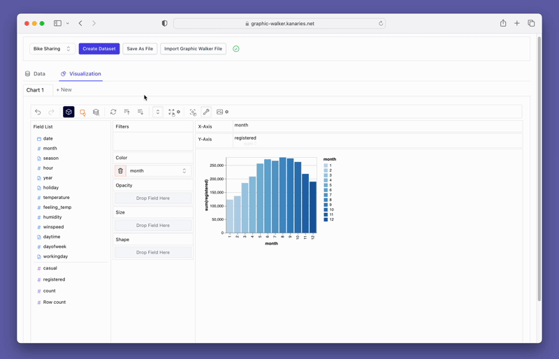
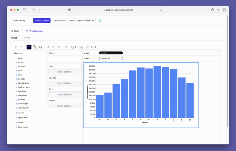
df = pd.read_csv('./bike_sharing_dc.csv', parse_dates=['date'])
gwalker = pyg.walk(df)
You can easily create these types of plots with your pandas dataframe without a graphical user interface:
Bar Chart 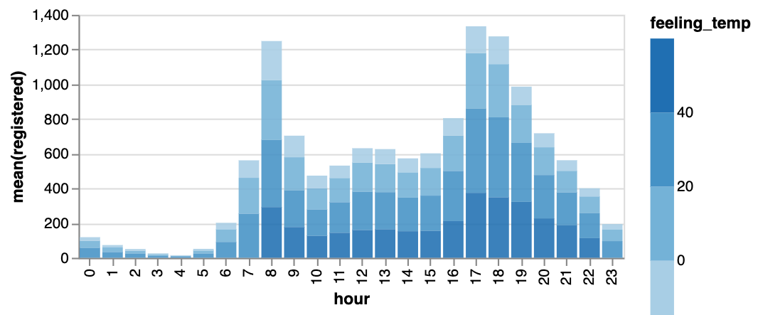 (opens in a new tab) (opens in a new tab) | Line Chart 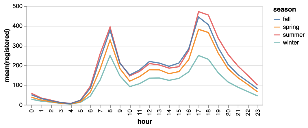 | Area Chart 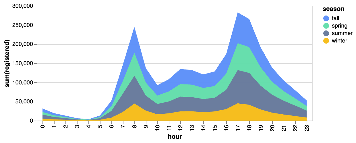 (opens in a new tab) (opens in a new tab) |
|---|---|---|
Trail 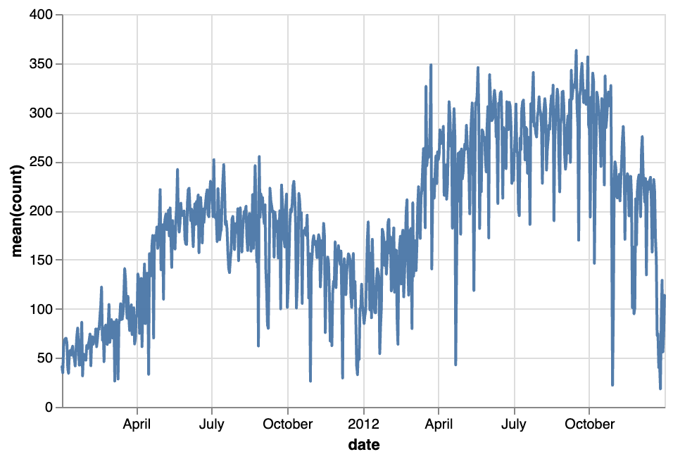 | Scatter Plot 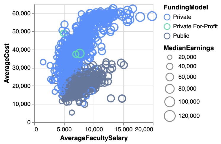 (opens in a new tab) (opens in a new tab) | Cirlce 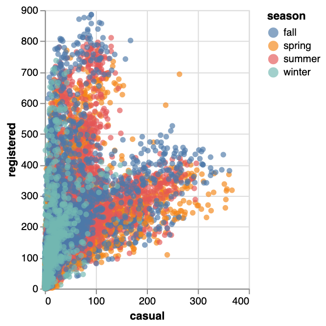 |
Tick Plot 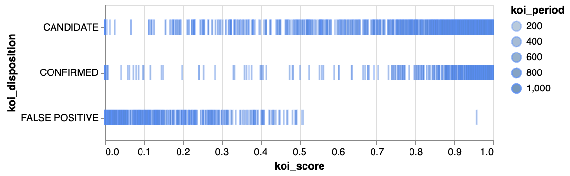 | Rectangle 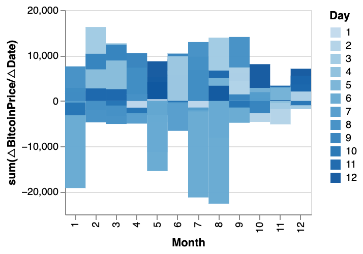 | Arc Diagram  |
Box Plot 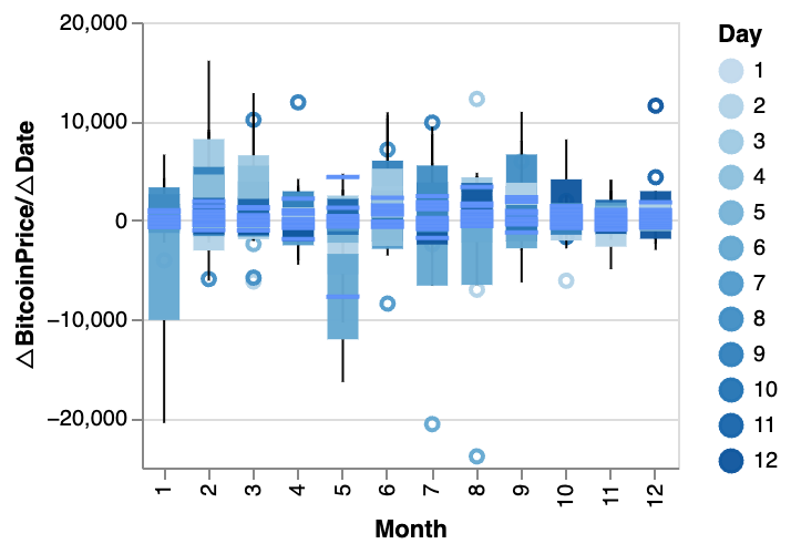 (opens in a new tab) (opens in a new tab) | Heatmap 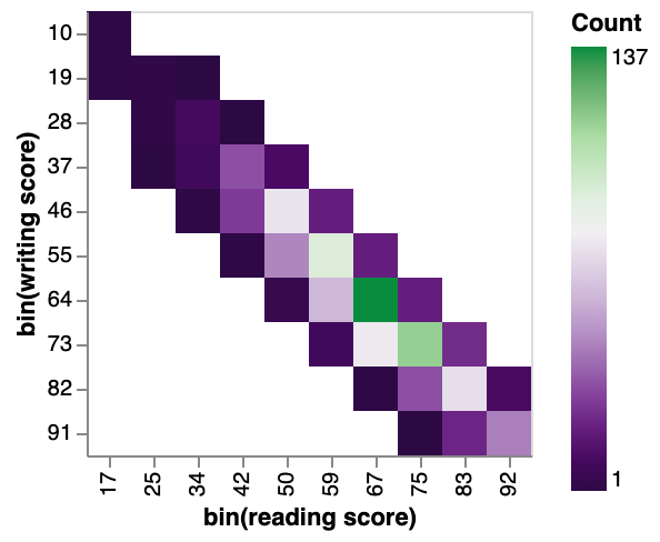 (opens in a new tab) (opens in a new tab) |
You can explore our Data Visualization Gallery for more Examples.
Resize a chart with PyGWalker
You can easily resize a chart with your mouse cursor.
Change the chart type
A line chart might demonstrate the trends of the registered user numbers better than a bar chart. To switch the existing chart to a line chart, click on the Mark Types option on the Tools bar and choose Line.
Create a Concat View
You may want to compare the differences between registered and casual users. Simply add more measures to the rows/columns and compare them.
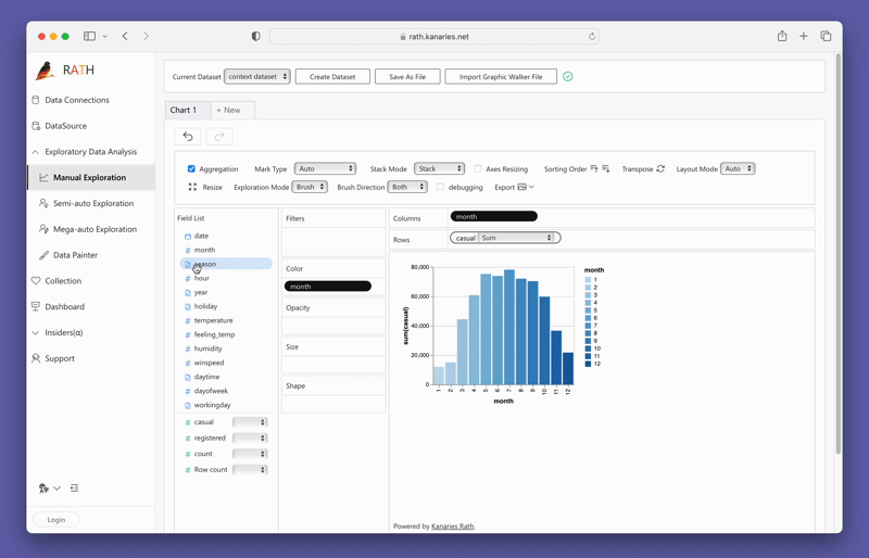
Don't forget to check out a more advanced, AI-empowered Automated Data Analysis tool: RATH (opens in a new tab). RATH is also open-sourced and hosted its source code on GitHub (opens in a new tab).
Conclusion
In conclusion, Matplotlib is a powerful data visualization tool that can be used to create stunning plots from pandas dataframes. In this article, we covered the basics of Matplotlib and PyGWalker for plotting, including how to create basic and advanced plots, customize plots, save plots to disk, and create tables from dataframes. By using Matplotlib and PyGWalker, data scientists can enhance their data visualization skills and gain insights from their data. Remember to keep practicing and exploring the various features of Matplotlib and PyGWalker to make the most of your data.